Sunday 20 December 2009
Bottle finished, Stille Nacht and Bah Humbug!
Tuesday 15 December 2009
One Green Bottle WIP 2
Sunday 13 December 2009
One Green Bottle WIP 1
Wednesday 9 December 2009
Another Cat Portrait
Monday 23 November 2009
Cambridge Visit
Here's the central quayside area where you can hop on a punt and mozey off down the river.....only today, as it was quite blustery and cold, that didn't seem like a wise option.
And....what a shop, it was great! These days, at least in my part of the world, there are fewer and fewer good art shops on our high streets. They are slowly disappearing probably because of the economic downturn but also, I think, because more and more people are choosing to shop online now for their art materials. It's good, though, to go to a real, live shop sometimes, wander around and see and feel things 'in the flesh', so to speak, isn't it? For example, I love the feel of papers........and this was an Aladdin's cave of papers.
I bought some Sennelier La Carte sanded paper - heaven! It was expensive though, £25.95 for an A3 pad (gulp!), but worth it I think. I also re-stocked my diminishing supplies of Art Spectrum Colourfix, although they didn't have all the colours I wanted. The Colourfix was available only in large sheets but I was able to use the (very large) guillotine to cut them down to the size I wanted. The shop assistant said she wasn't allowed to do this for me but I could do it myself. I think then if mistakes are made, the customer is responsible, rather than the shop. Also, rather more pertinently, if the assistant happened to cut off a finger or two in the process, the shop would have been up the creek without a paddle don't you think? If I had mutilated my own hand.....well that's just tough I suppose.
Anyhow, I emerged from the shop laden down with luscious papers, a few coloured pencils and eight fingers and two thumbs intact - phew! Incidentally, we could have done with borrowing that bicycle with basket, someone left temptingly parked outside the shop, to carry everything back to the coach park....sigh! All in all, a great day out.
Friday 20 November 2009
Another Keith Portrait
Approx. 8" x 10" on Black Art Spectrum Colourfix paper
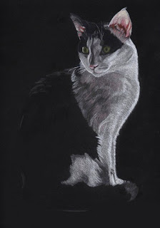
I started this one yesterday and I think it's about finished now so it hardly constitutes a "work in progress" in my usual fashion. I wanted a subject suitable for the sheet of black Colourfix paper I had left over and Keith, seen posing in my previous post, seemed appropriate. The paper drove me batty because it was a bit like wearing a black jumper, it attracted and showed up every bit of dust and debris going and I was forever blotting it with 'Blu Tack'! It does, however, give a picture a degree of drama which I like.
This drawing was a tricky one to get right in that the cat is backlit - he was standing on a window sill on a bright day - and so his face and most of his body is in shadow. I decided not to attempt a background because I think that would have killed the drama of the pose (plus I'm pretty rubbish at them!). I like drawing pictures with high contrast in them and exploiting the effects of light against dark, and vice versa to suggest form. The chiaroscuro tradition in art is one which interests me, mainly because I like a bit of drama!, and I'd like to do some more drawings along these lines.
I've used Derwent Coloursoft and Prismacolor pencils on this one.
Thursday 12 November 2009
Portrait of a Cat, done and dusted!
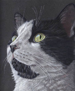
So here is my final version of Keith. I have added more white to the fur, emphasizing the highlights, using a Derwent Drawing Chinese White pencil. The fur needed more definition generally, I think, so I waded in with more Prismacolor Warm Greys, Indigo and Greyed Lavender. I also refined the pink ear and the nose a little more. The dark grey paper helped a lot in providing a foundation colour for the subject and speeded up the drawing process no end.
I prefer the way the Derwent Coloursoft lay down on this paper (Colorfix) as they are chalkier than Prismacolor and also, they never break on me - unlike the Prismas which tend to break a lot. The Prisma Indigo kept breaking in the sharpener so I put it in the microwave oven for 30 seconds - worked a treat! The waxy colour strip melts just enough to reform in the pencil shaft as an unbroken pencil once again - clever stuff huh?! You just have to remember not to 'over-cook' it though or it might explode! The only reason I persevere with the Prismacolor pencils is that they come in a much wider range of colours than the Derwent Coloursoft.
So what will I draw next then? I daren't make another 'statement of intent' because whenever I do that my plan always seems to turn to mush!
Monday 9 November 2009
Portrait of a Cat, almost finished
8" x 10" Coloured Pencil on Dark Grey Colorfix sanded paper
I started this pic yesterday and continued today - about 8 hours work so far. Prior to this I had been struggling with a still-life set up which was driving me nuts so I gave up on it to preserve my sanity. I then reminded myself of the old adage that when you become bereft of inspiration for your art, it's good to draw something you love. So that is what I've done!
This is a picture of Keith, one of my beloved cats. Keith is the quietest one of the bunch, he is very serene and good-natured and this is a typical pose of him. Poor Keith - I spent a long time staring at his face to get a better idea of the detail and his eye colours, I think he thinks I've flipped my lid!
He has one pink ear and a very pink nose which I've tried to capture. I'm out of practice with cat portraits and on screen it's looking rather too 'photographic' for my liking. Never mind, I shall put it away for a couple of days and then do some tweaking when the flaws in it will no doubt become more glaringly obvious. I'm using Prismacolor, all the lovely warm greys, and Derwent Coloursoft pencils.
Monday 2 November 2009
Autumn in the Park Finished - ish

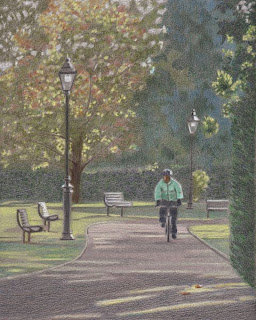
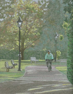
Well it's all done bar the tweaking. I've strengthened the colours using the same pencils as before and laying down the colours side by side, especially on the foliage, rather than on top of one another. I did not want a saturated 'painted' look, there are probably no more than 3 or 4 layers of colour in any one spot. All I'll do now is put it aside for a while and then tweak as necessary. It was interesting to do a landscape but they are not really my favourite topic. And......I'm so glad that cyclist was not in the foreground, I would have had to pay more serious attention to detailing him - Cripes!
Friday 30 October 2009
Autumn in the Park WIP 2
Wednesday 28 October 2009
Autumn in the Park WIP 1 plus Susan Boyle
8" x 10" on grey/green Canson Mi Teintes paper (reverse side)
Just started this landscape using Prismacolor and Derwent Coloursoft pencils. Haven't done a landscape in eons so I just fancied giving one a go and see what happens. I've spent approx. six hours on it so far, half of which was spent drawing the composition. The scene is a local park in early November a couple of years ago, the cyclist came along just at the right time when I snapped the photo! I have moved some of the elements for a better composition - not with a software programme but by my own hand on the paper, as it were. I'm using the pencils kind of like I would with pastels - scribbling away, dipping in and out with different colours and hoping it works! Now I've uploaded it I see loads of things that need adjustment. Early days yet, lots more work still to do on it.
And......I simply have to mention a song I heard a few days ago on the radio, Susan Boyle singing "Wild Horses", an old Rolling Stones classic. It stopped me in my tracks because it is so spine-tinglingly good. Here is a video of Susan giving a wonderful live performance of it on the America's Got Talent programme. Note that she doesn't fly onto the stage on a trapeze wearing next to nothing, she isn't surrounded by wriggly male dancers, she isn't under 30......oh and her voice hasn't been modulated or electronically 'enhanced'. How refreshing!! She doesn't need all that rubbish, she simply commands the stage with nothing but her humble presence and that wonderful voice. I understand her debut album, which includes this song, is due out on November 23rd and it will most definitely be on my Christmas Wish List!
Wednesday 21 October 2009
Autumn and a Leafy drawing
8" x 11" Coloured Pencil on Hahnemulle Bamboo Paper
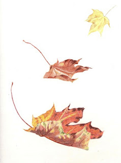
This drawing is derived from a bunch of leaves I gathered a few days ago in our local park. I did it quite quickly with a combination of Prismacolor and Derwent Coloursoft pencils. I would have done it on coloured paper but I wanted to try out this newish type of paper. It's fairly textured and I quite liked it but I wish it was available in colours other than white. I really wanted to put a background to it but a) it would have taken forever on white paper and b) I couldn't decide how on earth to do it! I took this photo of the Sycamore tree from whence the leaves came (the lady and her dog posed especially for me to give a sense of scale..... no they didn't really, I'm lying!).

As I'm in poetic mood, rare for me (!), and we are having an especially colourful autumn, I'll leave you with a verse from a poem called "Last Week in October" by Thomas Hardy (1840-1928) who is one of my favourite authors.
Thursday 15 October 2009
Two Tulips - Finished and Birmingham trip
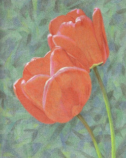
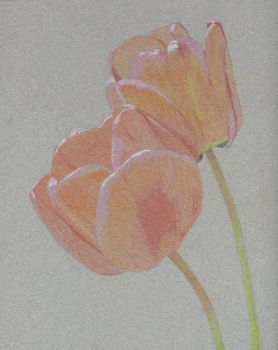
Well, I've added some more colour and tweaked it in places - I know, it doesn't look a great deal different from the last post but I so didn't want to overdo it! I did add a touch of yellow to the background (breaking my cool greens only rule!) but I thought it needed livening up a bit. I don't know whether I like it or not but maybe it will grow on me and at least I think I've achieved what I set out to do. One thing I did ponder over was how to get that shiny tulip petal look whilst not burnishing it and not filling the tooth of the paper - ah well, you can't have everything!
I went to the UKCPS Exhibition in Birmingham almost two weeks ago now so I'm mentioning it somewhat belatedly! I was struck by the diversity of the coloured pencil work on display, the different methods of working and subject matter. It's odd but the pictures I expected to like I wasn't that impressed with. Others that hadn't impressed me on the computer screen looked a great deal better in real life. It just goes to show that it really is worth seeing pictures 'in the flesh' if it's at all possible, although, of course, that is not always practical. It felt good to see my own two pics in there - I feel quite proud of that. I did take some photos of the exhibition but they are rubbish - the photos on the UKCPS blog are much better!
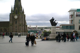
Anyway, I've never actually been to Birmingham City Centre so that was a first - sorry all you Brummies out there but I wasn't that impressed! Although the shopping experience was brilliant, quite frankly I fear the city planners, probably back in the 1960s, have made a right pig's ear of the place, haven't they? I found it quite bizarre. I snapped this photo (Ok, I'm a lousy photographer!) to illustrate the apparent incongruence, to me anyway, between the old and elegant church and the concrete mess that surrounds it. A beautiful ancient church to the left and a lacklustre concrete branch of Borders to the right! It's sad that this kind of scene is so common in many of our towns and cities.
Monday 12 October 2009
Two Tulips WIP 3

Here we are then two or three hours' work later. Using the same colours as previously, I've added another layer of colour overall. I'm doing this very gingerly because of the aforementioned paranoia about over-saturating the colours! I'm fighting the urge to put some stronger, brighter colour on that background - but I'm not giving in. I'll be strengthening the reds on the flowers next but using the juxtaposing method rather than blanket layering and the next post will see it finished. I'm still liking it so that's got to be a plus.
And.....here's a pic of Keith who had been watching my picture develop with some interest, I thought. However, I fear that boredom took over and he decided that watching me drawing was rather like watching paint dry and he'd much rather slip into this mode!
Friday 9 October 2009
Two Tulips WIP 2
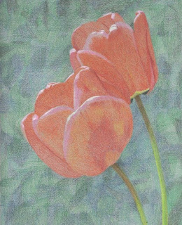
Another five or so hours work completed on this. I did the background very loosely with Derwent Coloursoft Green, Dark Green, Mint, Grey Green and Sea Green. I chose to stick to the cooler greens because I want the background to recede and, hopefully, make the flowers pop forward. I think it's working and I'm quite pleased with it - so far.
I've also started adding some reds, oranges and yellows to the petals and I'm doing the stems with warmer greens - Limepeel, Chartreuse and Moss (Prismacolor), again a ploy to push them forward. I hope all this attention to colour theory pays off! Still more to do on the petals but I hope I don't overdo it - oooh the tension is too much! (hehe).
Wednesday 7 October 2009
Two Tulips WIP 1
Thursday 24 September 2009
The National Portrait Gallery - my visit

Yesterday, I went to the National Portrait Gallery in London, a half-hour train journey from my home town, to get me some culture (!) and hopefully, some inspiration. The NPG exhibits portraiture of famous figures from Britain's illustrious (?) past and present. Whilst there are obviously some beautifully executed paintings in there, I must admit to finding the endless stream of paintings of Kings, Queens and Statesmen rather tedious. There seemed to be very few portraits of, or by, women and even fewer of, or by, people from other ethnic origins. Whilst the historical rationale for this is perhaps understandable, IMHO there is really little excuse for such a dearth in the available 20th Century and Contemporary art out there (or am I missing something?).
I'm no expert on the art appreciation front, as you can probably tell, but I do know what I like. A few paintings did catch my imagination. One such is this one of Louise Jane Jopling by Sir John Everett Millais, painted in 1879. I liked the 'no-nonsense', direct look on her face, the masterly colours and detail on her dress and the unsentimental way it was painted. It made a pleasant change from the overly pretty paintings of women by men that I had seen hitherto.
Another painting that struck me was this self portrait by L.S. Lowry. Apparently, he painted those red eyes as an expression of his grief over his mother's recent death. Lowry, famous for his paintings of stick-like figures against ordinary, industrial landscapes, was allegedly not given to expressing himself emotionally and that, for me, makes the painting all the more poignant. I was very moved by it. I love Lowry's work anyway - one of the few examples in British art of a painter depicting working-class people in ordinary, even mundane, settings.
At the risk of sounding unpatriotic, I really prefer the French and Dutch 'masters' when it comes to portraiture. Especially those who painted the 'common' man and woman, I don't have examples right now but you get the gist. Endless depictions of male statesmen, soldiers, royalty and even famous literary figures really don't cut the mustard for me I'm afraid.
I think I'm a bit of a renegade! Hey ho, might as well go the whole hog and express my horror at a contemporary picture I came across of Sir Ian Botham (cricketer). It stands about 6 feet high and I can honestly say that my own daughter could have painted a more engaging portrait than this at the age of three! What's that all about? I obviously would not make a good art critic - she said unapologetically.

Anyway, to save you any more of my rantings, here is a quick pic I took of Trafalgar Square (just around the corner from the NPG). It was hastily taken before I had to head off to top up my 'carbs' - I am diabetic and need to ensure that my glucose levels don't drop too low. That's my excuse anyway for putting away an enormous clotted cream scone ten minutes after I snapped this photo! Mmmm.
Monday 21 September 2009
Blue Marble Finished
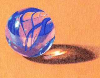
Another couple of hours work on this, having refined it here and there, and I'm calling it finished. I put a layer of Lemon Yellow (Coloursoft) on the background to tone down that gaudy orange background and this is a pretty accurate scan of the original drawing.
It was fun trying to get the 'right' mix of colours on this, especially on this coloured paper. My aim was to produce a drawing of photo rather than an exact replica of a photo and so I have refrained from saturating it with solid colour. There are no more than four layers of colour in any one place. I like the nice fine points you can get with Prismacolor pencils - it really makes a difference with something like this. I'm really quite pleased with it - she said hesitantly!
Wednesday 16 September 2009
Blue Marble WIP 2

About another 2 hours of work completed on this on the marble and shadow only. I've not added to the background as the colour is pretty strong anyway. I've used the same pencils as before to strengthen the colours. I'm liking this paper, its texture allows for lots of blending and easy adjustments. I don't think I could go back to white papers now - I can get good strong colours in much less time on coloured papers.
I see that the shadow needs more work - the marble itself is almost done. I have focused on the shapes I see within the marble - it's only when I stop and step back from the drawing that I actually see it as a marble! I find it fascinating that a different photo shot of the marble, perhaps moving the camera just a fraction and changing the direction of the light, would have produced an entirely different set of colours and patterns to draw. That, for me, is the beauty of glass and why it is such fun to draw it.
Blue Marble WIP 1
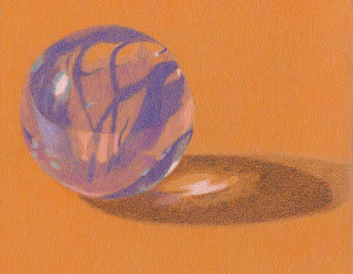
7" x 5.5" Prismacolor and Derwent Coloursoft Pencils on Canson Mi-Teintes pastel paper.
Back to basics with this new drawing - the humble marble. It looks like I've just plonked this marble down and started to draw it but that would be a gross oversimplification! The first thing you have to do is ensure that the surface you place it on is flat and level - the darned thing would not sit still! Of course, you could resort to the 'Blu Tack' remedy which is very effective if you want to position an object in a precise way in order to draw it (I've done this many times!). However, this won't work with a marble because it's see-through and so a blob of sticky tack would ruin the look!
Joking aside though, this simple little still-life set up involved much preparation and many mini decisions. Having chosen the marble, I then had to decide on the type and colour of surface to place it on. Next, I needed to decide about the lighting - natural or artificial. I used my daylight lamp for this one as it was a dull, overcast day. Then, I took about 45 shots of the marble from all sorts of angles and lighting conditions. And no, drawing it from life wouldn't have worked because I wanted to draw it large and would never have got all the detail.
The next stage is sifting through the shots and selecting the best ones. I find this pretty time-consuming because I go back and forth trying to decide which one(s) to use for my planned drawing. I will then crop the photo(s) every which way until I settle upon the one(s) I want to use. Then, I get to choose my pencils and start drawing. I regard all this preparation, prior to putting pencils to paper, as an integral part of the creative process and every bit as challenging as the drawing itself.
For this drawing, I'm using Canson Mi-Teintes paper, a pale orange, on the reverse side where it's not so textured. I've used Prismacolor Orange and Yellowed Orange on the background; Ultramarine, Powder Blue, Lilac, Parma Violet, Blush Pink, Light Aqua and White (Prisma) and Pale Blue (Derwent) on the marble; and....Crimson Red, Crimson Lake, Limepeel, Orange, Yellowed Orange on the shadow. The reds aren't showing up too well on this scan. Sharp pencils and careful attention to detail are the order of the day on this one!
Thursday 10 September 2009
Denzel Washington Portrait

6" x 7.5" Polychromos pencils in brown paper sketchbook.
This is a drawing from a TV programme, the Jonathan Ross Show. Now, I do not normally watch this show because I can't stand Jonathan Ross - he has an ego the size of a small country and I find him shallow and irritating. He tends to use his guests as a platform for his own jokes and ego-boosting rather than allowing them to tell their story in their own way - I don't like that.
Anyway, I made an exception this time because I rather like Denzel Washington - all round good chap, great actor and sooo good looking! Denzel has a rather quizzical expression on his face here - he's probably thinking 'does this man ever stop talking?'!
Wednesday 9 September 2009
Kiwi Fruit WIP 3

Tuesday 8 September 2009
Kiwi Fruit WIP 2

A few more hours of work done on this, mainly on the right half of the kiwi. It is looking darker now but it needs to go even darker to make that left half pop out more. This scan is pretty accurate and it's helpful to see it on the screen because I can see more clearly where I need to make adjustments. For example the light green areas look too bluish so I shall knock those back a bit.
For the record, I'm using Prismacolor Light Green, Pale Sage, Limepeel, Apple Green, Tuscan Red, Celadon Green, Grass Green, Pink Rose, Rosy Beige and a Dark Green whose name I don't know cos the printed name has rubbed off. And.....Derwent Coloursoft Green, Lime Green, Pea Green, Sea Green and Loganberry. Phew!
NB. I haven't got fed up with it yet...there's still time.....
Saturday 5 September 2009
Kiwi Fruit WIP 1

Good grief, it's over a fortnight since I posted anything here - what a slacker! Well, the 'glass' project I was thinking of doing is now on the back burner, so to speak, until I can come up with an idea for a set-up to draw.
I've started this drawing of a kiwi fruit, cropped from a photo I took some time ago. In fact, this is my fifth attempt to draw this particular photo! Previous attempts at it (not recently) kind of fizzled out - I would get to a certain point and then get bored and lose interest - how weird! I really like the photo though and I need to draw it, obviously!
This effort is on white Colorfix sanded paper and measures about 7" x 9". I'm using Prismacolour and Derwent Coloursoft pencils because of the wide range of greens in these brands. So far, this is about 15 hours work and there's still a fair way to go. I would have done it on green Colorfix but I don't have any left so it had to be white. The white version is much slower to work on than the coloured varieties but I like how this sanded paper forces me to work in a looser way than I would on smooth papers. The kiwi half on the right needs to be much darker so I'll be working on that next - then it's a matter of enriching the colour, especially at the edge, on the left half. I'm having fun with the greens! Fingers crossed I don't get fed up with it before it gets finished.
Note to self: Must cultivate some patience.
Thursday 20 August 2009
Viola finished and some news
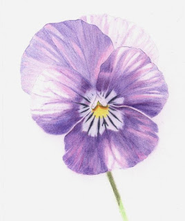
 Well, I finally finished the Viola - phew! It's only little, just 5.5" x 6.5", on Daler-Rowney Extra Smooth paper and I used FC Polychromos. Interesting exercise doing this in stages and having to describe what I did. I think I got all flummoxed about it because I was trying a bit too hard to get it right, rather than just 'going with the flow' which is what I normally do. So glad it's done now.
I heard at the weekend that two of my pictures have been accepted for the UK Coloured Pencil Society Exhibition in September - how exciting! They are both Still Life pictures I did a while ago and both measure approx. 9" x 8". This one, Little Bottle, was done on Goldline Fine Grain white paper with Polychromos pencils.

And this one, Empties, was done on Black card with Derwent Coloursofts.
I like drawing clear glass - although it's the reflections you are actually drawing, rather than the glass itself, isn't it? I'd like to do another glass arrangement for my next project so I'll be busy setting some stuff up and taking photos over the next couple of days. I want to use that piece of Fisher 400 (sanded paper) I have stashed away gathering dust - it deserves to be used!
Monday 17 August 2009
The Viola Adventure
Here are four of my five attempts to recreate a Viola (or Violas) for this task. One is on Fabriano 5 paper and the other three are on ordinary sandpaper (Fine Grit 600) from a local DIY shop and they were all abysmal failures!
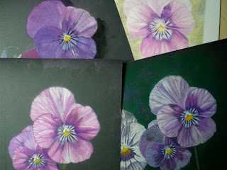
The sandpaper was going to give me a nice, brightly coloured, easily rendered and interesting picture. What was I thinking?! What do you generally do when your first attempt fails? You try again of course, learning from your mistakes and doing it differently. You do not, however, do it three times in almost exactly the same way, expecting somehow that some miracle is going to happen whereby a skilfully rendered, beautiful flower will emerge.
There are probably folks out there who can work wonders with pencils and bog standard sandpaper - if they can avoid choking on the pencil dust, that is - unfortunately, they do not include yours truly! And the other failure on Fabriano 5? Well, the colours were all wrong and the background was.....well.......enough said.
Anyway, here is the Viola picture I am actually doing for this task. It's the one I started doing in the first place, before I decided I could do it much better on other papers. It's really not that bad - Oh, the irony!! This image represents step three of the exercise and I am planning to have it finished by either step four or five.
And finally....... here's a picture of a natty little wooden pencil holder which someone at my art group was kind enough to make for me. It holds 13 pencils, even the stumpy ones, which is about right for the number I generally use for a single picture. Thanks John!
Saturday 8 August 2009
Waterlily WIP 3

More work done on the green leaves and tweaking elsewhere. I have burnished the water with a paper torchon and I think some of the subtle colours have been lost in the process - sigh! I am happy with the flower, though, and the general colour scheme and composition.
Some thoughts on process
I always have this dilemma about how much saturation of colour to lay down. I do like some paper texture to be showing as it is, after all, a pencil drawing. Also, I do not generally aim for photorealism as I really do not see the point of that when you may as well have the photograph to stand for itself . However, when you have a subject depicting smooth surfaces, such as the leaves and the water in this picture, the grain of the paper is more of a hindrance than a help. I could have done it more effectively on smooth Bristol Board perhaps?
Anyway, I'm sure I could improve on this - some things about it are really niggling me - however, I am getting bored with it now and am itching to start something new!
NB. Did anyone else see that strange orangey yellow ball in the sky today? Can't be certain but rumour has it that it was actually the sun! Well fancy that!
Tuesday 4 August 2009
Waterlily WIP 2

Sunday 2 August 2009
Waterlily WIP 1

Tuesday 28 July 2009
Purple Poppy Finished - ish

Monday 27 July 2009
Purple Poppy WIP 3

Saturday 25 July 2009
Purple Poppy WIP 2

Thursday 23 July 2009
Purple Poppy WIP 1

Monday 20 July 2009
Watery Waterperry


Tuesday 14 July 2009
White Daisy WIP 3

Another 3 hours or so of work done on this. I put a layer of Phthalo Blue and over that some more Sky Blue, in places on the background just to give it a bit more ooomph! My lighter blue pencils are now reduced to little stumps - oh the perils of sanded paper!
I have basically strengthened all the colours on the petals and tried to get more tonal contrast, more by lightening the light areas than putting down darker greys - if that makes any sense. It's quite satisfying being able to put lights over dark colours, as you can with this paper, and I have used a Chinese White Derwent Drawing Pencil as the final layer for the highlights.
I think it's probably about finished now. I'll put it away for a few days and then look at it again. No doubt something will shout at me to be tweaked, I'm never satisfied.


