Thursday 20 August 2009

Viola finished and some news

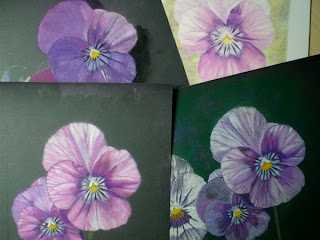
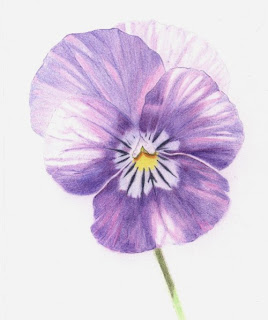
Well, I finally finished the Viola - phew! It's only little, just 5.5" x 6.5", on Daler-Rowney Extra Smooth paper and I used FC Polychromos. Interesting exercise doing this in stages and having to describe what I did. I think I got all flummoxed about it because I was trying a bit too hard to get it right, rather than just 'going with the flow' which is what I normally do. So glad it's done now.


I heard at the weekend that two of my pictures have been accepted for the UK Coloured Pencil Society Exhibition in September - how exciting! They are both Still Life pictures I did a while ago and both measure approx. 9" x 8". This one, Little Bottle, was done on Goldline Fine Grain white paper with Polychromos pencils.


And this one, Empties, was done on Black card with Derwent Coloursofts.


I like drawing clear glass - although it's the reflections you are actually drawing, rather than the glass itself, isn't it? I'd like to do another glass arrangement for my next project so I'll be busy setting some stuff up and taking photos over the next couple of days. I want to use that piece of Fisher 400 (sanded paper) I have stashed away gathering dust - it deserves to be used!

Monday 17 August 2009

The Viola Adventure

Who would have thought that this innocuous little flower could cause me so much grief? I have agreed to do a little step-by-step demonstration for the UKCPS stand at the forthcoming Art Materials Live event in Birmingham. The task has turned out to be far less straightforward than I envisaged.

Here are four of my five attempts to recreate a Viola (or Violas) for this task. One is on Fabriano 5 paper and the other three are on ordinary sandpaper (Fine Grit 600) from a local DIY shop and they were all abysmal failures!


The sandpaper was going to give me a nice, brightly coloured, easily rendered and interesting picture. What was I thinking?! What do you generally do when your first attempt fails? You try again of course, learning from your mistakes and doing it differently. You do not, however, do it three times in almost exactly the same way, expecting somehow that some miracle is going to happen whereby a skilfully rendered, beautiful flower will emerge.

There are probably folks out there who can work wonders with pencils and bog standard sandpaper - if they can avoid choking on the pencil dust, that is - unfortunately, they do not include yours truly! And the other failure on Fabriano 5? Well, the colours were all wrong and the background was.....well.......enough said.


Anyway, here is the Viola picture I am actually doing for this task. It's the one I started doing in the first place, before I decided I could do it much better on other papers. It's really not that bad - Oh, the irony!! This image represents step three of the exercise and I am planning to have it finished by either step four or five.


And finally....... here's a picture of a natty little wooden pencil holder which someone at my art group was kind enough to make for me. It holds 13 pencils, even the stumpy ones, which is about right for the number I generally use for a single picture. Thanks John!

Saturday 8 August 2009

Waterlily WIP 3


More work done on the green leaves and tweaking elsewhere. I have burnished the water with a paper torchon and I think some of the subtle colours have been lost in the process - sigh! I am happy with the flower, though, and the general colour scheme and composition.

Some thoughts on process

I always have this dilemma about how much saturation of colour to lay down. I do like some paper texture to be showing as it is, after all, a pencil drawing. Also, I do not generally aim for photorealism as I really do not see the point of that when you may as well have the photograph to stand for itself . However, when you have a subject depicting smooth surfaces, such as the leaves and the water in this picture, the grain of the paper is more of a hindrance than a help. I could have done it more effectively on smooth Bristol Board perhaps?

Anyway, I'm sure I could improve on this - some things about it are really niggling me - however, I am getting bored with it now and am itching to start something new!

NB. Did anyone else see that strange orangey yellow ball in the sky today? Can't be certain but rumour has it that it was actually the sun! Well fancy that!

Tuesday 4 August 2009

Waterlily WIP 2


Here we are then, another few hours of toil later on this one. I've worked quite a bit on the flower, the water and the red leaves. All I can say is respect to all those who do landscapes in coloured pencil - doing these leaves is driving me nuts! There's still a lot to do on the green leaves and I want to get those greens looking right. I put some Apple Green (Prisma) down on the upper green leaves but it looked cruddy so I erased it all. I'm spending some time testing out the greens on a spare area of the paper. Pencil colours lay down differently according to the colour of the support so testing them out first on your support is important.
On a different note, does anyone (in the UK) know where the summer's gone? (If it ever came in the first place). If I hear a weather reporter tell us one more time that it's going to rain I think I'll scream! Apparently, the Met Office have now backtracked on their 'promise' to us back in May that we were going to have a long, hot, 'barbecue' summer. Why don't they just admit that they can't do accurate long range forecasts? Here's my prediction for the coming week.....rain....and then more rain. Oh dear, had to get that whinge out of the way!

Sunday 2 August 2009

Waterlily WIP 1


8" x 7" Coloured Pencil on Rose Grey Colorfix sanded paper.
I took many photos of the waterlilies at Waterperry Gardens during my rain-soaked visit there - hence the water droplets, yes that's what those little blobs are meant to be! I'm using Prismacolor and Derwent Coloursoft pencils again. The pinks are HotPink, Pink (Prisma) and Bright Pink, Pink and Soft Pink (Coloursoft) so far. Other colours I've used are Bright Purple, Cranberry, Petrel Grey, Mid Grey, Grey Green (Coloursoft) and Magenta, Cool Greys, Black Grape, Celadon Green, Limepeel, Yellow Chartreuse and White (Prisma). I may add in other colours, if they seem appropriate, as I go along.
Photographs are inclined to not pick up accurately many of the subtle colours we see in nature and we have to rely, quite often, on our memory of what we saw. I want to try and capture the murky, dark, greeny grey colours of the pond water I actually saw when I was there. This shouldn't be difficult, in theory, given the wide range of pencil colours I have at my disposal! We'll see.

LinkWithin

Related Posts with Thumbnails