Friday 6 August 2010

Taking a Short Break


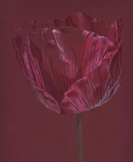
Apple, approx 7" x 7". Derwent Pastel Pencils on Canson Mi Teintes Paper                                         

Here's a little drawing I did from life very quickly with some pastel pencils I found in my drawer.  Just wanted to upload something other than the very finished, detailed stuff I've got into the habit of doing in recent months.  Simple and rough, yet quite refreshing I think.

I've been very busy lately with family stuff and getting out and about, making the most of the summer season which is so short here in the UK.  Art-making has taken a bit of a back seat but I'm hoping to gather some fresh material - and inspiration - to draw from (pun intentional) in the next couple of weeks.  Blog posts will therefore be pretty spartan now until the beginning of September when I hope to return with some new artwork.

In the meantime, here's Bobby in a box......


He has taken to sleeping here, right next to my working space, despite there being a myriad of other much more comfortable places around the house in which to snuggle down.  He likes to be where I am I think.....aah! 

Tuesday 27 July 2010

Marbles Portrait


"Five Marbles".  11" x 14.5", Derwent Coloursoft Pencils on Sennelier La Carte Pastel Card (Dark Grey).

Well here's the completed picture I did for the Derwent Pencils Company.  It is a larger piece than I normally do but, strangely, it didn't really take a great deal longer to do than a smaller piece.  The detailing is the same whatever the size, in fact, I think it's easier because it's not so fiddly and you've got the freedom to do bold, broad strokes.  I had wondered how on earth pencil artists do their large pieces, much bigger than this, without going totally bonkers!  Now, I'm thinking working big is maybe not so onerous as it seems.

One might think that the logical surface to draw marbles on would be smooth white paper.  However, I chose to use a dark grey 'La Carte' pastel card for two main reasons.  Firstly, coverage is quicker and the Coloursoft seemed to lay down very softly and smoothly.  Secondly, it's harder to work precisely or get bogged down in detail on this rougher paper - you are kind of forced to work more loosely which, I think, yields a less 'photographic'-looking result.  I used the pencils dry, with no solvents, and used cotton buds and a hardish bristle brush in circular strokes to smooth out the pigment on the marbles. 

I'm really not into slavishly copying my photos.  I'm not that good a photographer that I get brilliant photos worthy of exact copying anyway!  Nor am I keen on jiggery pokery with photo software, I'd rather be drawing.  What I do is choose a photo and then interpret it in my own way, exaggerate colours, leave extraneous bits out, bring out the colours in shadows and so on.  Whilst this drawing could be regarded as photorealistic, especially as you see it on the screen here, it is most definitely a drawing in actuality. 

I took many, many photos of marbles in different lighting, positioning and group combinations before I came up with a composition I thought would make a good drawn image.  Derwent wanted a portrait format, rather than landscape, of 'close-up' marbles, which was more of a challenge, I think.

Hmm, all in all, I'm quite pleased with this one.  It looks especially good when viewed from a distance, something which is hard to achieve with a smaller drawing, I think.

Ooh, I nearly forgot to say, I had the thumbs up from Derwent today (Phew!) so the drawing is now winging its way up north to them.

Sunday 18 July 2010

Some light relief from PC madness

I finally got my PC back, hmmm.  The data they managed to recover was negligible but at least it still works.  I spent most of Friday and all day yesterday reinstalling programs and uploading stuff.  As I was doing this, Windows insisted on trying to install updates - two years' worth of them.  I tried to delay them but I lost the battle in the end and gave in to the bossy reminders.  89 updates later (yes, 89!) I'm left wondering what the point of these updates is anyway, given that they didn't prevent Windows going AWOL in the first place!  I think I'll get a MAC next time around.

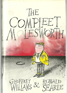
When I wasn't spitting feathers at the computer screen I actually did some tidying up in my office.  The stacks of books and art materials were becoming a health hazard and badly needed organizing and storing sensibly.  The trouble is that I begin well and then get sidetracked by something I come across during the clearout - I think this is called task avoidance!  On this occasion it was a book I've had for about 15 years and which always makes me laugh.  It's a compilation of a series of books written in the 1950s by Geoffrey Willans and illustrated, brilliantly, by Ronald Searle.


It's all about a schoolboy called Molesworth who writes a diary about life at 'Skool'.  His quirky spelling and witty prose describing his experiences of swots, snekes, swankpots, gurls, wizard wheezes, weeds, dirty rotters, parents and (how to avoid) lessons is soo funny! (At least, to me anyway). 


I've always been a fan of books about schooldays, especially funny ones like this.  Here's an excerpt...


And here's another....


Caption: "Special attention is paid to health and all boys are under the supervision of a qualified matron who has at her disposal the full resources of the sick room."

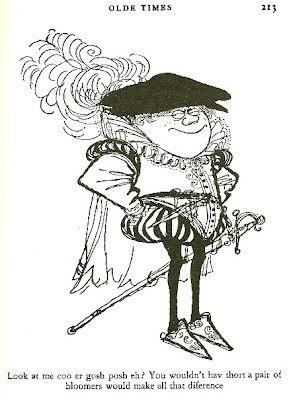
And here's my favourite.....


Caption: "Look at me coo er gosh posh eh?  You wouldn't hav thort a pair of bloomers would make all that difference. "

(All images and excerpts copyright G. Willan and R. Searle)

Hehe!  Ah well, bak to the tidying up!  Sigh.

Tuesday 13 July 2010

Busy, busy and....."More Tea Vicar?"

Crumbs, how time flies when you're busy!  Life and family issues have taken precedence over artwork over the last few days but today has been marbles day - taking pics, cropping pics, playing with potential compositions for a drawing.  There are so many choices to make before pencils finally make contact with paper and the drawing gets under way.  Marbles have been drawn by many coloured pencil artists so it's a challenge to try and do something different.  Good fun though!  The only thing that's certain so far is that I'll be using Derwent Coloursoft pencils and this drawing will be around A3 size - big for me!

As a bit of light relief, I thought I'd post some pics of a little Birthday treat I had last week.  My sister gave me a gift of 'tea for two' at a local Manor house so I took my long-suffering friend, Maggie, with me.  Here's where we went, Flitwick Manor......


Now I'm not really into stately homes, even little ones like this.  The people who live in them generally own far too much of this country's precious land and have more money than they know what to do with ~ just my beliefs.  However, my sister knows I love my tea and I really appreciated her gift.  So, as the saying goes ~ "More tea vicar?"!.....


As you can see, we were given more cakes than any bod should reasonably expect to eat at one sitting ~ but we didn't complain!  There is a gap on the bottom platter where there had been two huge scones, these had already been eaten by the time the photo was taken, hehe.  I know this may be hard to believe, and we are both quite slim (maybe not for much longer!) but we polished off every cake you see here ...... oh and also the cucumber and smoked salmon sandwiches which preceded them!   Absolutely delicious!  Just to rub it in, here we are savouring the moment .....


What was really nice was the fact that we had English Breakfast leaf tea - not bags, proper tea in a china teapot!  I always drink leaf tea in a pot at home but you rarely get it elsewhere these days, which I think is a crime. 

And here's a pic of a magnificent cedar tree in the gardens.  Apparently, that big branch on the ground broke off under the weight of snow that fell earlier this year during the arctic winter we had.


And finally, here's a pic of a birthday card sent to me by a friend (I'll get her back!).  I hasten to add that I deplore ageism in all its forms......however, I'm afraid I had to lighten up when I got this!  Methinks if you're going to go to exercise class, best not to wear a dress........jogging pants, or slacks might be a better option?!


Copyright M.I.L.K.  Moments of Intimacy, Laughter and Kinship

Wednesday 7 July 2010

Wild Poppy Final and some news!


Here's a better image of the drawing, I took a photo of it which gives a more accurate image than that grainy scan I uploaded yesterday.  The greens still aren't quite true but hey ho it's the best I can do.  It bugs me when the image isn't right.

On another note, I've been asked to draw some marbles with Coloursoft Pencils by the Derwent Pencil Company.  How cool is that?!  It's a subject I love to draw so I'm really looking forward to it.  I won't upload the picture until it's finished as I don't think it would be appropriate to do it as a work-in-progress.  Well, I'd better go and dust off that big box of lovely marbles I have stashed away and get cracking on a composition!

On yet another note, if anyone has emailed me at the address in the sidebar on the right here, I apologise for not replying - I cannot access that account at the moment due to my pc problems.  If you wish to email me any time, for the moment, it would be better to do so at this address instead ~
janet.pantry (at) btinternet.com.  Many thanks.
 

Tuesday 6 July 2010

Wild Poppy WIP 2


Another three hours work done on this today and it's just about finished.  Of course, when it's uploaded to the computer screen I start to see lots of flaws in it and little niggly bits I want to change!  I did the background with Greens from the Caran d'Ache Supracolor range - Light Green, Emerald Green, Dark Green and also Night Green (Lyra Rembrandt) which is the darkest green I have. 

The background was done very roughly and randomly with cross-hatching.  I find that if I do it too carefully it ends up looking overdone.  On my laptop screen (not ideal) the greens are not as 'true' as they are in real life but I can't correct them without the photo software which is on my PC.  Lordy knows what this drawing will look like on other screens!  Ah well, I'll have a look at it tomorrow and do some tweaking if necessary, then I'll take a pic of it in the daylight and see if I can get a better scan of it.  Having said all that, I'm quite happy with this one, all in all.

Friday 2 July 2010

Wild Poppy and Ice Cold in Alex


Approx. 7" x 7"  Coloured Pencil on Aubergine Colourfix sanded paper.  Work in Progress.


My friend, Maggie and I took advantage of the gloriously hot weather we've been having lately and went for a walk in the lovely countryside we have around our way.  Needless to say, we did get lost despite being armed with a carefully planned route and a decent map.  We were trekking happily down the side of a field admiring the wild flora when Maggie turned and ventured to suggest that the row of trees on our left wasn't supposed to be on our left, according to the map she was holding, but on our right.  I said, in a moment of logical clarity (I get those sometimes!), that perhaps we should retrace our steps, find a path along the other side of the trees and follow that.  We then decided that whichever side of the trees we walked we would end up in the same place (!) so we decided to continue along the original path.


Maggie the Map Reader


So there we were, tripping happily down the path, admiring the views, merrily quipping that we were glad to be well away from the noisy drone of traffic and other humans.  The mood changed pretty rapidly, however, when we were ....how shall I put this?... overcome by a pungent and extremely unpleasant smell.  We had arrived at a large sewerage works, surrounded on all sides by a high fence, with no further pathway around, or away from, the area.  Just more fields and an almighty stench. 

Our only option was to go back up the steep, long path in the direction we came from across more fields....and some woodland.....and yet more fields in a pathetic attempt to get back onto the circular walk we were supposed to be doing.  The map was next to useless by now because it gave us no indication as to where we actually were since nothing we saw matched anything illustrated on the map (Lol).  What you need in these circumstances is a brain which can cope with spatial awareness and tell you, at least roughly, in which direction to head for in order to get you back to where you started from.  Either that or a compass!  We had neither of these handy things.

All we could do was to head towards the distant sound of traffic which would take us back to civilisation.  How ironic that the very sound we had initially wanted to get away from suddenly became very welcome and comforting!  By the time we got back to my little car sitting in the village pub car park, we were hot, tuckered out, blistered and very thirsty.  It was a bit like that old film called "Ice Cold In Alex" with John Mills and Sylvia Sims....you know the one?  Only not quite so hot and exotic, just li'l ol' England.  Oh and yes, we did go into the pub and have a very long, cold drink!

This wild poppy, the drawing shown way back up top here, is from a photo I took on our walk.  It was one of a few growing wild in a field.  Poppies look so fragile with their papery petals blowing in the breeze.  I want to try and capture the feel of that.  I'm using a mixture of pencil brands here, chosen purely on colour - pale lavendars and lilacs, aubergine, pale greens, yellow and whites.  I want to add some greens as a background, if I'm brave enough!

NB.  My PC is still in dock being repaired, she said optimistically.  And this laptop I'm using would try the patience of a saint!  
        

Tuesday 29 June 2010

Meltdown

My drawing flow has been temporarily disrupted by more computer problems sent from the gods to test my sanity .... again.  Windows Vista has decreed that it no longer wishes to function on my PC and has decided to go AWOL.  Unfortunately, I have not kept my data back-up routine up to date and so have had to send the offending article off for a data recovery operation which may, or may not be successful.  I'm trying to stay positive even though I'm very, very pee'd off about it, not so much about the possible data and program loss but about the fact that it happened in the first place. 

I'm always very careful on my computer and have good anti-virus protection and yet, I'm told, this sort of thing can happen out of the blue. Windows files, apparently, can just get corrupted and permanently jam up the whole system....just like that.  In the blink of an eye all the precious stuff you have painstakingly installed and uploaded over some considerable time, and not sufficiently backed up, can be gone.  Be warned folks, Be warned!

Anyway, I'm using an old laptop at the moment so I can continue using email and the Internet....and the printer/scanner too.  I also have many of my photos and drawings on other devices so it's not so bad.  Worse things can happen, can't they?  I still have my pencils and paper.... now they can't disappear into the great unknown, can they?  I Will Survive!


Friday 25 June 2010

Rose Interior, finished, and Wimbledon


I tinkered some more with this and it's about finished.  It was tricky doing some of the petals convincingly...... they are positioned at different angles, of course, and so the light is hitting them in all sorts of strange ways.  This is a photo of the drawing, rather than a scan, and doesn't really show up the nuances of colour in there very well.

I've concluded that although I like the Supracolor pencils, some of them are a bit scratchy on the Stonehenge.  Prismacolor pencils, being softer, work much better on it, I think.  I'm not too keen on white paper although I've seen wondrous work done on it by others with far more patience than me!

On another note, I'm eating these........


and watching this....on TV......


........at the moment.  Well not exactly this match, it was Gasquet and Fish on Court No. 1  at Wimbledon two years ago but you get my drift!  I took this photo when I went to Wimbledon two years ago.  I know.... our seats were pretty far back - lucky I had my binoculars with me at the time! 

I love watching the tennis and I enter for the ballot each year to try and get tickets at Wimbledon - it's the cheapest way to get them.  The other ways to get in are that  a) you are, or know, royalty (er... nope);   b) you have connections through a tennis club (er... nope);  c) you have corporate, group affiliations (er... nope); d) you are willing to camp out all night and queue for hours at the gate the next day (er... definitely a no-no!).

It's great to go see the tennis at Wimbledon, there's a really nice atmosphere.  It's well-organized, very civilised, and very.....well.... English, I suppose.  Here's another pic.....


On another note, normally I really don't care for football.  However..........Come on England!!


Sunday 20 June 2010

Rose Interior. WIP 2


Here's a quick update on this modest little drawing.  I've spent about 8 hours on this so far, even though it is quite small.  There are lots of intricate shapes in those petals - I have yet to work on the lower left hand side.  I normally scan in my drawings as I seem to get a better image that way.  This one scanned really badly, however - I think, because it's a bright picture and also my scanner is pretty basic.  So with this drawing, I've taken photos which, to my surprise, have produced better, more accurate, images of it.

Normally, I would cover the whole image with a first layer of colours and then move in to refine the detail, adjust tones and intensify colours.  Can't help it, I'm an orderly sort of person!  On this one, though, I have deviated from that a bit and played with the yellows and greens to try and get that intensity of colour in the central area.  So the next step is to render those bottom petals, review the whole image and move into the final touches.  There is no doubt that working on white paper is more laborious and exacting than working on my usual tinted papers.  Still good fun to do though!

Thursday 17 June 2010

Rose Interior. WIP 1


5" x 7" Caran d'Ache Supracolor pencils on Stonehenge paper.

I know, I was going to do something on Black Stonehenge paper.  Well, I did start a drawing on that paper but a disastrous choice of pencil colours meant that it had to be abandoned and it's just too cruddy to show!  I did actually like working on that paper, it's very soft and I could get nice strong colours..... just not the right colours!  I'll try it again soon.

In the meantime, here's a little number I've just started.  I took lots of photos last week of some roses which were in glorious bloom in my daughter's garden.  It was a sunny, slightly cloudy, day and the light was perfect for taking pictures.  I dithered for ages trying to decide on a good crop for this drawing and I settled on this one.  I think the closer you get into a flower the wider the range of hues you can see.

I'm using the Supracolor again because the yellows in this range are really nice.  I'm using about 8 different yellows on this plus Khaki Green which is a very light green.  I'm also using Light Purple and Aubergine.  These colours, I think, would be fine on a darker paper but because this paper is White I need some shades even lighter than this so I've brought into play some trusty Prismacolors - Pale Sage, Lilac, Lavender and Greyed Lavender - too.  

This first draft looks a bit rough and ready even though it's taken about 3 hours to get it looking like this!  One reason for taking so long is that I can't be as cavalier with the pencil strokes on White paper, it's not very forgiving and it shows every mark.  Another reason is that I like to get the shapes just right ( just call me anal!).  Once the shapes are 'right' then I can concentrate on the colours and tones.  Hope that makes sense!  A way to go yet.
   

Thursday 10 June 2010

Viola Close-up Final


I'm calling this done now.  I've added a little colour here and there and changed a small detail on the background (spot the difference?) just to aid the composition.  No, I'm not telling you what I did!  It's pretty accurate in terms of colours and contrast although those colour transitions are much less obvious in real life.  They're smoother I think and some of the subtlety is not coming through on screen (honest!).

All in all I'm quite pleased with how it turned out.  I could take it further and add more strokes to make it look more polished but I like to see the support showing through - it looks more lively somehow.  I enjoyed working on the card, the pencils glided on quite smoothly - even better when they are really sharp.  I'm planning on doing a drawing on Black Stonehenge paper next - I've never used that support and I've heard it can be a bit of a challenge.  Gotta try it then haven't I?!

Here's a pic of my Official Keeper of the Pencils, Bobby.


He loves the Blues, as you can see!  At least he doesn't make off with my Blu Tack blob like Barley does.  Yes, he's still doing it, despite repeated reprimands from me.  I've tried to outwit him by hiding it where I think he won't spot it - hehe, who am I kidding?!

Tuesday 8 June 2010

Viola Close-up WIP 2


I worked about 4 hours more on this today and it's almost finished, I just need to do a little tweaking here and there.  I was afraid that maybe the green card would dominate too much but I think it's okay.  I won't list all the pencils I used - too numerous! - but there are 8 greens, including turquoise green, indigo, periwinkle blue, aubergine, orange, 3 yellows, cream and white from the Supracolor range.  I also used Prismacolor Lilac and, to get that background really dark, I used Lyra Rembrandt Night Green which is the darkest green I've found in any of the brands I have.

Lots of people tend to shy away from using coloured pencils on dark papers, mainly because it seems really hard to get good, strong, bright colour down.  I rather like working on dark paper now so I thought I'd put down a few of the things I've learned - someone might find them useful.  

My tips for working on dark paper

  1. Firstly, I choose a shade of paper according to the subject I want to draw and the effect I want to achieve.  Usually, this shade will act as the base colour for the picture thus cutting down the amount of time I'd have to spend laying down pencil colours.  The paper colour I use is integral to the picture I'm doing, so I choose carefully.  Sometimes I get it wrong but it usually works out well.
  2. To keep my colours vibrant, I'll lay down different colours side by side rather than layering one on top of another.  I've found that heavy layering tends to dull down the colours and make them muddy.  By 'side by side' I mean a few fine strokes of one colour and then, alongside, a few of another colour with minimal overlap.
  3. Occasionally......just occasionally......when I want to achieve a really dark shade, I'll mix 2 (maybe even 3!) colours together.  On the Viola, for example, I layered Aubergine, Indigo and Night Green to achieve those inky patches on the background.   
  4. I'm very sparing with the White pencil when it comes to the brighter areas.  I use creams for 'white' areas and add White pencil only on the very brightest parts of my subject.  I've found that doing this makes highlights stand out much more.
These are just a few ideas, I'm sure there are many more out there.  Feel free to let me know!

Sunday 6 June 2010

New Drawing.......at last! Viola Close-up WIP 1


Viola close-up.  5" x 7".  Caran d'Ache Supracolor pencils (mainly) on smooth green card

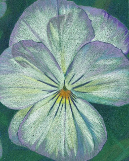
It's been a while since I posted any art....... just couldn't get into creative mode..... but I've dusted off some pencils and just started this little flower.  I have a big tub of Violas in my garden, all of the pale violet/cream variety, bursting into bloom - they smell and look gorgeous!  I started a bigger picture of Violas and foliage but it wasn't going well so I cropped it down to this close-up of a single flower which I will now focus on.

I'm having a break from my usual paper, Colourfix, and I'm using some smooth card for a change.  I bought a stash of this card in assorted colours from an Art Fair last year without any real idea of what I intended to do with it!  I think I have some sort of paper fetish (Lol).  I like the feel and smell of it and have to buy it, especially if it's different from anything I've seen before (Hmmm, does that sound alarming?!).  Anyway, the card is made by the Paper Company and is surprisingly nice to work on, although it's quite thin and doesn't take many layers of pencil.

I'm using Caran d'Ache Supracolor pencils which are water-soluble, though I'm using them dry because I don't like what happens when you add water!  These pencils are really nice - great range of colours.  They are harder than other brands like Coloursoft and Prismacolor but because of that they keep a lovely sharp point and I find they lay down really smoothly on this card.

I chose a strong green colour for this drawing because it gives me a head start for the dark background, adds a touch of drama and I just prefer to work light over dark.  This strategy works well with sanded papers but sometimes backfires on smoother papers when you can't get the lighter colours to 'sing'.  Anyway, on this one I'm trying to lay the colours down side by side so they don't 'muddy up'.  I'm aiming to bring out the subtlety of the lovely pastel shades in this flower......a way to go yet.......it could well go 'belly up'!

Thursday 13 May 2010

Artless Interlude

My blogging friend, Paula Pertile, coined a great phrase this week 'Art Limbo' which summarised so well her feelings about where she is at with her art right now.  I think many of us have probably been in this place at some time or another.  For me, it signifies a kind of paralysis which sets in from time to time when the art stops flowing, the ideas dry up and the enthusiasm wanes - at least that's how it feels for me at the moment!  It's a waiting game with me, if nothing comes then I'll just have to do other things until inspiration strikes!

In the meantime I've been soaking up Springtime.......which means Bluebells!  We are lucky enough to have some ancient woodland virtually on our doorstep so I thought I'd post up a few photos of mine taken at Ashridge Park.  The bluebells are out for only about two weeks so when word gets out that they've 'arrived' hoards of people descend upon the area to see them.


My photos don't really show the true splendour of the scene and the light wasn't great.  You have to be there to drink in all the gorgeous colours and see the blue-violet carpet of all those bluebells.  Magical.             

Friday 7 May 2010

A kitty story and more politics


Inca.  8" x 8" Derwent Coloursoft on smooth cartridge paper.

I've been doing some boring but necessary admin, trawling through my digital photo stock of all my drawings, labelling and organizing them into some sort of recognizable order.  It has been interesting to look back at some of my early stuff and discern some of the changes in my work, and hopefully improvements, since then.  I came across this little drawing I did of Inca, my daughter's cat, about three years ago.  I was quite proud of it at the time and still like it.  Looking at it now, though, I see that it could do with a little more definition on the nose and those lighter areas.


Inca, believe it or not, is mum to our four black and white cats, Keith, Bob, Barley and Whiteface.  There were six kittens in that litter and all were black and white.  No prizes for guessing what the father must have looked like!  Inca has since been spayed and, until about a month ago, was living with us.  She was often hostile to her boys, even though they are all neutered, and seemed not to want them around.  I figured that maybe it was just her natural instinct to push them away and off into the big wide world.  So.....we took the decision to give her to a good friend of mine who had recently lost her own cat and was really keen to have her. 

We weren't sure how it would turn out......whether she'd miss her boys or they'd miss her....but kept the option open for her to return if it didn't work out.  At first we missed having her around but I'm pleased to say that it seems to working out very well.  She has settled in well with my friend who dotes on her and her boys seem unphased by her absence....in fact, they all appear to be far more relaxed now.  A good call I think.....phew!

And now for something completely different.  Hey, I live in a country which has, today, become a kind of 'government no mans land'!  The people decided to 'hang' the parliament after the General Election - the first time that's happened for about thirty years!  It was essentially a three-horse race and no single party achieved a clear mandate to form the new government.  The upshot of it all is that two or more parties will have to form some sort of pact, or coalition, in order to go to the Queen with a mandate to govern the country. 

As I write this, Cameron (Conservative) is talking to Clegg (Liberal Democrat) to see if they can do a deal.  Hmmm......that's gonna be tough as they disagree on some pretty crucial issues.   Gordon Brown (Labour), who came second in terms of parliamentary seats, is looking like 'Billy no mates' at the moment!  That could change, though, because there are so many different permutations possible in terms of how the government can be formed and it will take at least a few days to sort it out.

Personally, I think the hung parliament is a Good Thing. It is clear that the electorate wants change, not only in terms of who runs the country but also the voting system itself.  We seem to be heading for a more mature system of consensual politics, perhaps proportional representation of the kind they have in most other European countries.  Not before time I reckon.  There are people, including those in the media, who are impatient with indecision and the so-called 'chaos' of it all - they want certainty, they want things to be either black or white.  They want to herald in a new leader....now.... because then they will feel safe.  But I say let's stay in the 'grey' area for a while and work things through in a measured way.  After all, as we artists already know, there are lots of different colours in grey, aren't there?  Grey can be infinitely interesting!

I'd better get off my soap box now.  I'm not usually this interested in the political scene but I've been following the commentary on this all day and I kind of got hooked....can you tell?! 

Saturday 1 May 2010

Minnie Finished


Here's my final version of Minnie after a bit of tweaking here and there.  I so didn't want to overdo it and, to me, it still looks a little underdone.  But, I have paid heed to the comments of my wise arty friends here and decided to STOP before it's too late!  It is a joy working on Colourfix paper, I don't think I could go back to smooth white paper now.     

Wednesday 28 April 2010

Cat Portrait: Minnie WIP 2


A few hours more work done on Minnie today.  I have now laid down the initial colours for the whole image.  It's always good to get to this point because now I feel that the 'donkey work' of putting in the main shapes and tonal areas is largely done.  I can now see the whole 'picture' and start to enrich the colours, adjust values and generally refine things where necessary.  The left hand side of the cat, for example, needs to go quite a bit darker.

This initial process takes a lot of concentration because I'm trying to establish the cat's markings, correct tonal values, anatomical accuracy and colour harmony all at the same time.  Quite tricky but I'm pleased with progress so far.  I'm running low on some of my pencils so I've ordered some more - why do I leave these things until the last minute?  Bad planning!

Monday 26 April 2010

Cat Portrait: Minnie WIP 1


8" x 10"  Coloured Pencil on Soft Umber Colourfix sanded paper

Well I finally got my PC back, it had to have a new power pack installed which set me back £110 of which the labour cost was £70.....hmmm.  Wish I was techie minded, could have put it in myself
for nothing!  Anyway, here we are with another drawing, not the one I had originally lined up to show - that was a daffodil which started well and then turned into a nightmare.  I think I am jinxed when it comes to drawing yellow subjects on dark paper, same thing happened with a carnation I did a while back!  Ah well, all those lovely yellow pencils I wanted to use will have to wait.....until next time.

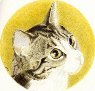
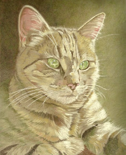
Back to topic.  This is a drawing of Minnie, my beautiful 10 year old tabby cat.  She has been with us from a kitten and enjoyed solitary feline status until the boys, Keith and Bob, came along and later.....my daughter's three cats too.  It took her a while to adjust to the presence of all the boys invading her territory but she gets lots of fussing to compensate and they all get along fine now.

I was snapping lots of shots of flowers in the garden on a beautiful Spring day when I looked up and saw Minnie stretched out on the patio table, bathed in sunlight. I took a few snapshots of her and and this is a crop from one of them - the flowers will have to wait!

I'm using mostly Polychromos pencils supplemented with some Prismacolors.  The Poly range is a bit short on the lighter shades I need for this drawing so I'm using lovely Prisma shades, Peach Beige Ginger Root, Nectar, Rosy Beige, Pale Sage, Jade and Celadon Green.  There's still no substitute for the Poly shade, Ivory, though, which I'm using quite a lot on this one.  Here are a couple of quick snaps of the equipment I'm using.


For this portrait, I'm including more of the cat's body for a change.  As you can see I'm working my way down slooowly and there remains lots and LOTS more to do.

Saturday 17 April 2010

Computer Problems Grrr! And a bit of politics.

Just thought I'd better check in as I haven't posted for a while.  I've been having a few problems with my PC lately and then yesterday, it decided to crash out completely - I have no idea why, except that it seems to be a power problem, some kind of electrical fault I think.  I am using a borrowed laptop at the moment without any of my usual software or data files.  It's painfully slow but better than nothing I suppose!  It could be a week or so before I get my PC back and I'm hoping it is reparable as it's only two years old - but then, I'm told, that's positively ancient in computer terms!  I have a new drawing coming but cannot upload it yet - far too challenging to do that on the laptop!

And now, just thought I'd mention, for those of you who don't already know, that we have a General Election looming in the UK.  Everyone here is positively glued to the TV and radio to hear the scintillating commentary on the policies promoted by our illustrious political contenders in the race for No. 10 Downing Street.  If you believe that, you'll believe anything!  It's unsurprising, I think, that there is such apparent apathy and cynicism (or is it just me?) among the British people about our politicians in terms of both their behaviour in recent times - not good - and the stuff that generally comes out of their mouths. 

Now don't get me wrong, I have always voted in both national and local elections because I am proud of our democracy and believe everyone should vote.  My daughters will tell you how I always nag them to get out and vote, that they are lucky to have the right to do so and that Suffragettes fought, and some died, in the early 20th century so that women would have that right.  There is a lot of apathy though, especially amongst younger people in this country, probably largely because they have not known war or real poverty or, indeed, what it means to be disenfranchised.  I really hope that none of us has to experience any of those things again in order to be shaken out of this apathy.

There has been a lot of talk about the real possibility of a 'hung' parliament which essentially means that the major competing political parties will have to share power - instead of winner takes all!  Personally, I think that's a great idea, imagine...... the three main bods, or should I call them The Three Stooges!, Brown, Cameron and Clegg, all having to sit round a table and agree on policies instead of wasting their energy arguing with each other!  And.......would they all then have to move into No.10 together?   Oooh, very cosy!!

Ah well, I'm off to see if I can find a TV channel that doesn't have a politician or news commentator spouting off about the economy, education or the NHS to me.  Now there's a challenge!

Sunday 4 April 2010

Samantha WIP 3 Final


Thank you, folks, for putting up with my major rant about BT.  I should really go and bash up some cushions or something instead of broadcasting my frustrations!  It's crazy how these things get to you so much though isn't it?  They do say that internet access is fast becoming as important as other utilities such as water, gas and electrickery!  Thus, getting cut off can be majorly traumatic! 

Anyway, here's Samantha finished at last.  The scan is pretty accurate colourwise, although not terribly high quality in terms of definition.  I darkened the hair and neck, adding Dark Sepia, Walnut Brown, Burnt Ochre, Sanguine.  I also added more of the same colours as before to the skin tones and smoothed them out with some cotton buds. 

I had been concerned that the strong blue hat might have overpowered her pale skin tones but I think her blue dress helps to balance things out nicely.  One thing about sanded paper is that a lot of pencil dust is generated and the temptation is to blow it away as you work.  However, it can stain the paper so I had to be careful not to get those dark blues onto the skin and hair areas.  All in all, I'm quite pleased with how it turned out.

Wednesday 31 March 2010

Fun and Games with BT

More to come on my Samantha portrait very soon.  I've been having such a traumatic time back and forth on the phone with that wonderful (not) company British Telecom that I just have to write it down somewhere - so if you don't like my rantings please click off now!

BT (British Telecom), in my humble opinion, is the most incompetent, inefficient, inept, unwieldy and thoroughly useless company I have ever dealt with as a humble customer of internet service provision.  Yes, I am now looking into other options, such as cable/ satellite, which do not have to rely on our ancient landline system for good, reliable broadband speeds.  I realise that our landline system is now groaning under the strain of the ever increasing demand for high speed broadband and that fibre optics (like I know what they are!) are the way to go for the future.  However there is absolutely NO excuse for BT's shambolic customer service system.  Anybody who has had the misfortune to have contacted this will know what I mean.

About a month ago, a workman, working on road repairs, accidentally cut through a cable which effectively disabled the internet service to 46,000 homes and businesses around my home town area for 48 hours or so.  Ok, accidents happen, and I appreciate this was going to take a while to sort out and we have to be patient.  We eventually got our internet connection back but Broadband speeds have been very erratic, too low for downloads, video streaming and so on, ever since.  

For the past three weeks I have been 'liaising' with BT customer advisers.  Each time I phone, or they phone me, we have to run through a gamut of routine questions, always with a different 'adviser', always without reference to any calls I've made previously.  If I have to tell one more BT person that I have a wireless router and that its green lights ARE all flashing I will most definitely throw the d**n thing out of the window!!  I have had around 25 robotic conversations with BT personnel in the past week or so and I'm now slowly, but surely, heading for the van with the men in white coats.

During some of our conversations, I've chilled out a bit, realising that they are only doing their job, working from a script and it's no use trying to cut to the chase - just go with the flow, we'll get there in the end.  Even if it does take about an hour and a half to do so.  Other times, I demand to speak to the Manager, whose name I am careful to write down, but he turns out to be equally robotic, unhelpful and ineffective - just with a slightly better command of English!  

The last Manager I spoke to told me, and I quote :  "Mrs Pantry, I'm sorry but my tool isn't working properly so I cannot check your connection..."   I commiserated with him, saying I hoped he could get his tool up and running again soon and laughed.  Bad move.  There was a long silence.  I've made several attempts at some humour during these conversations, vainly trying to retain some of my sanity, but they have all wooshed over the automaton on the other end of the line like water off a duck's back.  These people are not human.  Seriously, they are not - they read their instructions from a script and if you, the customer, dare to deviate from this and venture a few suggestions of your own, you will be ignored and the script gets repeated again.

One thing that does make me laugh is the message you get, when you call the service line, which says  "please be aware that some calls may be recorded for training purposes".  Who is BT kidding here?  If that were true then how come the company hasn't learnt anything from these calls?  The conversations I, and many others, have had with BT customer service lines recently are as innane, unproductive, frustrating and pointless as they always were.  So BT, you are being, at best, disingenuous in trying to suggest that you care a jot about the effectiveness of your customer service lines.  In a word, they are c**p.  Oh, and by the way, BT Yahoo, a pathetic offshoot of the BT brand, is also complete rubbish as well, but that's a whole other story!

End of rant.

Monday 29 March 2010

Samantha Portrait WIP 2


I did a few more hours work on this today and then some more joyous time trying to get an accurate image of it to upload here!  There is a slight cast shadow across the top from the scan and the highlights aren't quite as blobby as they look here, apart from that it's about right.

I re-adjusted the patterning on the hat and it looks more accurate now.  I spent quite some time on her hair, using Light Yellow Ochre, Ivory, Cinnamon, Burnt Ochre, Bistre, Raw Umber, Burnt Sienna.  Haven't quite finished the right side of the hair yet, my eyes were starting to cross so I had to stop for today!  I also did some more on the skin tones using Light Flesh, Medium Flesh and Prismacolor Rosy Beige, Peach Beige and Peach too as the Polychromos range is a bit short on these lighter shades. 

I think I have her expression about right so I don't want to do too much more on her face, just slight tweaking and blending in.  Did I hear someone say 'what about the background'?  Er.....nope, must be hearing things!   Haven't messed up yet but that could change.  No.....come on, stay positive Janet! 

Sunday 28 March 2010

Samantha Portrait WIP 1


10 x 8" Polychromos Pencils on Colourfix sanded paper (Rich Beige)

This drawing is based on a photograph by Kelly Herdrich who kindly gave it on loan to Peter Weatherill, a fellow artist and tutor.  So, my thanks go to Kelly and Peter.

Yes it's true, I am a glutton for punishment - another portrait.  Normally, I work from my own photos and it's a little tricky drawing someone whom I've not met since I know nothing about the person and have not seen them 'in the flesh' as it were.  On the other hand, not knowing the subject means you're not going to bring your own preconceptions to the drawing, as mentioned in my previous post.
 The little girl's dress was originally pink and white but I've changed that to blue to give a better balance to the picture and lessen the impact of that hat (I think!).  I'm using some Turquoise Blues and Prussian Blue for the hat and dress.  For the hat, I laid down some Bluish Turquoise and Cobalt Green first and then smoothed it out with some cotton buds. Then I've gone back in with Prussian Blue to model some of the stitching.  It's a fine balance, I think, between not making the stitching too detailed and artificially regular and yet making sure that it reads as a knitted hat.  There's still work to do on the hat so we'll see.

Samantha's expression looks almost like a sneer so it'll be tricky to capture that without overdoing it and doing her an injustice!  She's quite young so I'm guessing she might be a little shy about having her photo taken.  I need to keep her skin tones quite light and also not age her too much.  Haven't decided about the background yet, hmmmm.

Saturday 20 March 2010

Update on "Little Man", the portrait

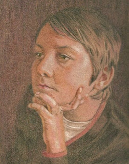
Well, I've received back some feedback on the portrait I did of Ben, my 11 year old nephew (see previous two posts).  Both Karen, my sister, and Ben himself both prefer the earlier version which they feel is most like him.  Karen said she thinks it has "a certain something about it" which is not there in the finished version.  She agrees that the final picture portrays him as older than he actually looks but the hair and eyes are very accurate.  Ben thinks his nose is too big in the final version (!), the earlier one is just right and he wants to thank me for making him look good!  A young diplomat in the making I think!

I've learnt a lot from doing this portrait.  Here are some of my conclusions.

1. Drawing a member of your own family is especially challenging because you cannot help but be influenced, consciously and unconsciously, by your own knowledge and perceptions of that person.  I often see Ben as a very wise head on young shoulders, he astounds me sometimes with his mature and thoughtful comments - perhaps that's why I ended up drawing him looking older than his years.

2.  Drawing from a photograph is most definitely not an easy option, as some people would have us believe.  It does, however, require a lot of careful consideration and skill if we want to end up with a drawing that projects an impression of freshness and vibrancy, alongside accuracy and realism.  I know this is possible.  I'm working on it!

3.  The early stages of my portraits, and other subjects too, almost always look fresher, more vibrant and more accurate than the finished versions.  I find it very difficult to determine that nebulous point of no return, you know, when the picture is done and it's either good or it's bad.  I'll say things like "if I just make that a bit darker" or "that eye isn't quite right" or "it looks too insipid!" when I know I should be saying "it's good enough now, doing more on it won't improve it"!  Would that I had the wisdom to be able to say the latter a lot more often!

4.  I love doing portraits just because they are so difficult to do well and I really want to do them well.  Do you detect a whiff of masochism in there?!

And finally...... Ben (of portrait fame) is running the Sport Relief Mile tomorrow to raise lots of money for this great cause. GO BEN and no slacking or you won't get my money!! (Just joshing, hehe).  

Friday 19 March 2010

"Little Man" Portrait - Finished


Another 5 hours or so of work done on this and I think I'm calling it done now.   I've used Polychromos throughout, except for a layer of Blackberry (Derwent Coloursoft) on the background to get it darker.  I had great fun (er...not really!) trying to get an accurate digi image of my drawing.  After much cussing and blaming the software, I finally arrived at a pretty faithful representation.

In trying to render the values correctly in this I think I probably overdid it a bit with the reds.  This brown paper does not take as much punishment as my usual sanded papers and you cannot put light colours over dark quite so readily.  I'm quite pleased with it though and I want to use it as a kind of prototype for a larger portrait of the same pose which I'll do on sanded paper.

There is something weird about this drawing.  Having finished it, I've noticed that Ben seems to look about five years older than he did in the earlier version of the drawing!!  Maybe my brain's addled or something but I think I've aged him unintentionally.  Is it just me or does anyone else see this too?  I'm not sure now which version is the more authentic in terms of how Ben actually looks.  To resolve this I'm going to email copies of both the earlier draft and the finished drawing to Ben and his mum (my sister) and ask for their views.  It'll be interesting to hear what they think.  I'll report back.

Monday 15 March 2010

Some New Art! Little Man WIP 1


"Little Man" 6" x 8" FC Polychromos Pencils in Brown Sketchbook

Here's another attempt at a portrait, about 6 or 7 hours' work so far.  It's a picture of my nephew, Ben, who is 11 years old, caught in a rare quiet moment!  Ben is a lovely boy, full of beans and very bright.  I want to try and capture his likeness in this thoughtful mode.  I recently bought a new printer/scanner but I don't think it scans as well as my old one, deep joy.  This scan of the drawing so far was the best I could get but I think the colours are pretty close anyway.

I really like the Polychromos pencil range for portraits, there are some nice subtle browns and reds like Nougat, Bistre, Van Dyck Brown, Caput Mortuum, Dark Sepia, Raw Umber, Burnt Ochre, Terracotta, Venetian Red.  I've used all these and more on this.  I'm trying to get a dark, moody look on the drawing (what's new?!) so I've used layers of Caput Mortuum Violet and Dark Sepia on the background and it will get darker still. 

I think I must be a bit of a masochist because this is so hard.....just look at that hand position....good grief!  I really like the pose though and wanted to try something a bit more challenging.  I've spent a while getting the basic colours in and trying to establish a likeness.  From now on it's a question of adjusting the values, blending colours and hoping I don't overdo it.  Fingers crossed!  

Friday 5 March 2010

No art, just reflections and some trivia

Artistic inspiration has deserted me just now and I have no artwork to show.  I have, however, been thinking long and hard about where I want to go with my art, why I'm doing it and trying to get some sort of planning for the future in place.  Until now I've just been 'going with the flow', so to speak, but I think it's time to get myself organised, establish some goals, like.... to sell my art or not to sell?  If so, sell what, how, where?  If not to sell, then I could continue drawing for pleasure only.  I think I've reached a crossroads now and I need to make some concrete decisions and then move on down my chosen path.  I suspect this angst is why the drawing is not happening for me at the moment.  I'll work it out.

On a lighter note, dare I say it....could it be that weather-wise we have turned a corner and Spring is on its way?  Or are these a mirage!


Crocuses are erupting in my garden!  Now I could say that we have purposefully decided to allow our garden to return to a natural 'meadow-like' state but that would be such a bare-faced lie!  The truth is we are too darned lazy to get out there and look after it properly....you know, with carefully planned planting, weeding and the like.  I have to admit that although I do appreciate gorgeous flowers and plants and love to draw them, I really cannot muster up an ounce of enthusiasm for gardening.  My most hated BBC radio programme is "Gardener's Question Time" - I find it crushingly boring!  Hence the wilderness that you see here - pretty though, isn't it?

Now here's something closer to my heart! 


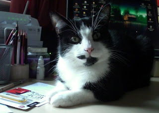
This is Bobby, brother to Keith and brother (once removed) to Barley whom you may remember from previous posts on this blog.  Do not be fooled by that nonchalant look, Bobby is King Pin, the Top Cat of this family.  He positions himself in front of my computer screen at key times during the day, if that is where I am, of course, and does not budge.  Who needs language when you can communicate your needs as effectively as this!   This posturing translates as "it's time you quit staring at that thing and started preparing a meal for myself, my brothers and other feline relatives!" 

And finally, there's this......


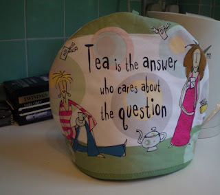
I am one of a dwindling number of people who actually still like my tea brewed properly in a teapot - remember those?  I spotted this tea cosy in town recently and had to buy it.   Need I say more?!     

Wednesday 24 February 2010

Single Rose Finished


I did a little more tweaking here and there with the same pencils as before and intensified the colours.  I've tried to work very lightly, pressure-wise, so as not to saturate the paper and allow the subtle nuances of different pink and red hues to show through.  The stem and leafy bits are a tad more yellow-green than is showing here. 

All of Lauren's roses have now wilted and gone so I'm glad I snapped all those shots of them.  Lauren likes this pic so I'll frame it for her as a keepsake.  I didn't do a background on it (chickened out!) but I think it's OK as it is.

Sunday 21 February 2010

Single Rose WIP 1


6" x 8" Derwent Coloursoft and Prismacolor Pencils on Rose Grey Colourfix sanded paper

I just started this rose, this is about six hours work so far.  I've not had much inspiration lately - sometimes I cannot decide what I want to draw, I think you could call it 'artists' block'.  It's like that though, art, peaks and troughs, isn't it?  Anyway, I was stirred into action after last Sunday, Valentine's Day, when my daughter, Lauren, who lives with us at present, received a dozen roses delivered to the door - how romantic is that?  Lucky lady!  Naturally, at this time of year, flowers are a bit thin on the ground and I like to draw them, sooo..... out came the camera and I snapped about a zillion shots of those roses.  Hence the current drawing.

I'm working on a light coloured paper this time as it suits the subject matter better.  I've become so used to the way pencil colours look on dark surfaces that it's been very strange re-discovering what the colours do on light paper!  Pinks, for example, appear darker and stronger on light paper, especially sanded paper, so I'm having to test all the colours first.  They also interact with each other differently - yikes! - so, as I do like to try and get the colours and tones just right, it has been quite a painstaking process to get this far in the drawing.

I have, thus far, laid down the basic colours and tonal areas.  I'm using most of the Pinks in Coloursoft and Prismacolor plus Poppy Red, Pale Vermillion, Dark Purple, Lavender and Lilac (Prismacolor).  I'll be adding more colour next, refining and adjusting the tones and having a rethink about that stem and other green bits which are looking decidedly dodgy!

Saturday 6 February 2010

Single Poppy Finished


Here's the finished drawing.  Fraid I skipped a couple of stages because it looked dreadful as I continued to work on it - almost scrapped it!  I used Black Grape (Prismacolor), Green and Dark Green (Derwent Coloursoft) on the background which has changed the look of the piece somewhat, made it more dramatic.  For the flower itself, I continued with the colours already used and added Process Red and Black Grape (Prisma), Pink Lavender, Deep Fuscia (Coloursoft). 

This poppy was a gorgeous shade of purple so it was probably unwise to have drawn in on Burgundy paper (duh!), consequently, I was fighting the paper all the way.  Should have done it on the Aubergine paper instead - isn't hindsight a wonderful thing?! 

It's one thing to draw the picture but it's quite another to scan it accurately so that it is faithfully reproduced in digital form.  This drove me ever so slightly nuts.  I think it was because the reds and greens were fighting each other.  Anyway, this is a pretty accurate image of the drawing, I got there in the end and it didn't turn out too badly.  Looking at it now, I do wish I had left more space around the flower to give it more room to breathe, you know?  Never satisfied (Hehe).

Thursday 4 February 2010

Single Poppy WIP 1


8" x 10" on Burgundy Colourfix sanded paper, Derwent Coloursoft and Prismacolor Pencils.

Fancied doing a flower again, haven't done one for a while.  I found this photo among a batch I took last summer - I drew another version called 'Purple Poppy' in July 2009, here's the blog link.  This current one is on the same paper as the previous drawing although I thought the colour was Aubergine at the time, wrong - it's called Burgundy!  I've just had a new consignment of Colourfix paper, I really like it better than any other sanded/tinted papers I've tried.

For the record, I'm using Loganberry, Cranberry, Deep Fuscia, Pink Lavender, Rose (Coloursoft) and Dahlia Purple, Tuscan Red, Magenta, Hot Pink, Jade (Prismacolor) so far.  For the stem I've used Hooker's Green (Derwent Inktense), Dark Green and Celadon Green (Prismacolor).  For the brightest highlights I always use a Chinese White Derwent Drawing pencil.  I have yet to deploy one of the best colours in the Prismacolor range - Black Grape (what a star!) for the darkest areas on the flower.

I'm quite pleased with it so far.  I'll carry on to finish covering the flower with the first layer of colours and then consider what the heck I'm going to do with the background - always a challenge!    


LinkWithin

Related Posts with Thumbnails