Wednesday 24 February 2010

Single Rose Finished


I did a little more tweaking here and there with the same pencils as before and intensified the colours.  I've tried to work very lightly, pressure-wise, so as not to saturate the paper and allow the subtle nuances of different pink and red hues to show through.  The stem and leafy bits are a tad more yellow-green than is showing here. 

All of Lauren's roses have now wilted and gone so I'm glad I snapped all those shots of them.  Lauren likes this pic so I'll frame it for her as a keepsake.  I didn't do a background on it (chickened out!) but I think it's OK as it is.

Sunday 21 February 2010

Single Rose WIP 1


6" x 8" Derwent Coloursoft and Prismacolor Pencils on Rose Grey Colourfix sanded paper

I just started this rose, this is about six hours work so far.  I've not had much inspiration lately - sometimes I cannot decide what I want to draw, I think you could call it 'artists' block'.  It's like that though, art, peaks and troughs, isn't it?  Anyway, I was stirred into action after last Sunday, Valentine's Day, when my daughter, Lauren, who lives with us at present, received a dozen roses delivered to the door - how romantic is that?  Lucky lady!  Naturally, at this time of year, flowers are a bit thin on the ground and I like to draw them, sooo..... out came the camera and I snapped about a zillion shots of those roses.  Hence the current drawing.

I'm working on a light coloured paper this time as it suits the subject matter better.  I've become so used to the way pencil colours look on dark surfaces that it's been very strange re-discovering what the colours do on light paper!  Pinks, for example, appear darker and stronger on light paper, especially sanded paper, so I'm having to test all the colours first.  They also interact with each other differently - yikes! - so, as I do like to try and get the colours and tones just right, it has been quite a painstaking process to get this far in the drawing.

I have, thus far, laid down the basic colours and tonal areas.  I'm using most of the Pinks in Coloursoft and Prismacolor plus Poppy Red, Pale Vermillion, Dark Purple, Lavender and Lilac (Prismacolor).  I'll be adding more colour next, refining and adjusting the tones and having a rethink about that stem and other green bits which are looking decidedly dodgy!

Saturday 6 February 2010

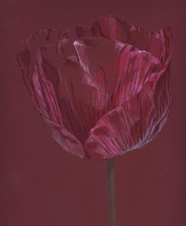
Single Poppy Finished


Here's the finished drawing.  Fraid I skipped a couple of stages because it looked dreadful as I continued to work on it - almost scrapped it!  I used Black Grape (Prismacolor), Green and Dark Green (Derwent Coloursoft) on the background which has changed the look of the piece somewhat, made it more dramatic.  For the flower itself, I continued with the colours already used and added Process Red and Black Grape (Prisma), Pink Lavender, Deep Fuscia (Coloursoft). 

This poppy was a gorgeous shade of purple so it was probably unwise to have drawn in on Burgundy paper (duh!), consequently, I was fighting the paper all the way.  Should have done it on the Aubergine paper instead - isn't hindsight a wonderful thing?! 

It's one thing to draw the picture but it's quite another to scan it accurately so that it is faithfully reproduced in digital form.  This drove me ever so slightly nuts.  I think it was because the reds and greens were fighting each other.  Anyway, this is a pretty accurate image of the drawing, I got there in the end and it didn't turn out too badly.  Looking at it now, I do wish I had left more space around the flower to give it more room to breathe, you know?  Never satisfied (Hehe).

Thursday 4 February 2010

Single Poppy WIP 1


8" x 10" on Burgundy Colourfix sanded paper, Derwent Coloursoft and Prismacolor Pencils.

Fancied doing a flower again, haven't done one for a while.  I found this photo among a batch I took last summer - I drew another version called 'Purple Poppy' in July 2009, here's the blog link.  This current one is on the same paper as the previous drawing although I thought the colour was Aubergine at the time, wrong - it's called Burgundy!  I've just had a new consignment of Colourfix paper, I really like it better than any other sanded/tinted papers I've tried.

For the record, I'm using Loganberry, Cranberry, Deep Fuscia, Pink Lavender, Rose (Coloursoft) and Dahlia Purple, Tuscan Red, Magenta, Hot Pink, Jade (Prismacolor) so far.  For the stem I've used Hooker's Green (Derwent Inktense), Dark Green and Celadon Green (Prismacolor).  For the brightest highlights I always use a Chinese White Derwent Drawing pencil.  I have yet to deploy one of the best colours in the Prismacolor range - Black Grape (what a star!) for the darkest areas on the flower.

I'm quite pleased with it so far.  I'll carry on to finish covering the flower with the first layer of colours and then consider what the heck I'm going to do with the background - always a challenge!    


LinkWithin

Related Posts with Thumbnails