Sunday 30 October 2011

Nil Desperandum! The portrait continues ...


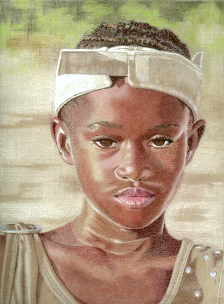
Worked a fair bit more on this, as you can see.  I've just had a tip from Pauline Longley about applying mineral spirit to the base colours and then continuing to work on as usual.  Thanks Pauline, I didn't think of that!  I'm not a big fan of solvents to be honest as I'm not too bothered about having a smooth finish, however, it may have been useful here in getting a smooth light base to work from.  Can't do it on this one now because I've done a lot more work on it.

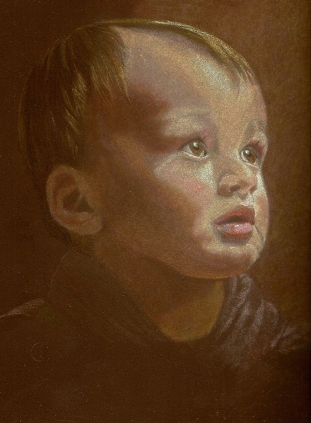
After a lot of brain-racking about the waxy light pencil problem, I thought maybe a different kind of pencil might help so I dug out a neglected tin of Caran D'Ache Supracolor water-soluble pencils.  I figured they are harder and not so waxy as my usual cps.  I have a set of 120 so a good colour range and I'm using them dry.  Bit of a gamble, they could be really scratchy, but they are going down really well on this paper and they sharpen to a lovely fine point!

You won't believe the number of times I've almost ripped this picture up.  I vacillate between thinking "this is utter c**p, why am I wasting my time?" and "oh it's not so bad, I'll keep going and see what happens".  Well I've kept going and I'm in positive mode at the moment.  The main problem I'm having is trying to get smooth transitions between shades of colour ~ so important for drawing skin.  I seemed to manage this ok on my previous portrait (Rachael) but I think this is harder because the paper colour is so dark.  I'm doing a lot of colour testing around the edges of this drawing and using up a lot of cotton buds blending too!  It's all good learning I suppose.  Lots more to do so I'll soldier on, including adjusting his left eye which is too big.

It's anybody's guess whether my next post will be this portrait or a flower image I've got my eye on!

Saturday 29 October 2011

Little Boy Portrait started ...


About 10" x 8" Coloured pencil on Dark Umber Colourfix sanded paper.  Based on a photo by Rosalind Amorin posted on the Paint My Photo site. 


My thanks to Rosalind for allowing me to experiment with her photo!

This is a rather ambitious interpretation of the photo and I'm not sure it will work ~ well, you have to push the boat out sometimes, even if it sinks!  I want his face to be in the spotlight, as it were, with everything else in the shadows.  Well that's the image I have in my head ... whether I can get that down on paper is quite another thing!  I've simplified the image by leaving out his hand and the chair because they were a bit distracting.  This image of the drawing is pretty accurate but the scan shadow on the left is annoying, can't get rid of it.

So far I've drawn the basic features and blocked in some tonal areas.  I'm using a mixture of pencils, mainly FC Polychromos and Prismacolor.  I've used Artichoke and Bronze (Prismas) along with dark browns for the shadowy bits.  There are also strokes of Pale Vermillion, Cinnamon, Greyed Lavender, Clay Rose in there too along with all the different Peaches.

I'm having trouble with the light areas on his face.  To get his face light enough on this dark paper, I've laid down Light Peaches and Creams with the intention of going in over the top with darker hues.  Trouble is, lighter pencil colours tend to be very waxy, especially the Prismas, and so darker hues do not sit well on top.  I'm getting 'blotchy' patches and it's driving me crazy!  Ah well, I'll keep trying different things on it.  I might crack it ...  then again ... I might give it up as a bad job and start a flower instead!  Hey ho.
    

Friday 21 October 2011

Green Bottle WIP 3 Final


Worked on this some 4 hours or so more.  Instead of going at it in one marathon drawing fest, so to speak, I've been dipping in, leaving it and then dipping in again over a couple of days.  That strategy seems to work better for me because I'm seeing it with fresh eyes each time ~ it's amazing how parts of the drawing jump out at me demanding to be tweaked each time I look!

I refined the foreground area a little more and, having completed the bottle itself, decided that the background did not need to go any darker.  I also decided not to saturate the paper with colour, I prefer the 'grainy' look.  This has been a case of 'softly, softly' pencil strokes, a constant process of adjusting colours and values across the whole image until I'm happy with it.  And, guess what?  I'm happy with it!
  

Tuesday 18 October 2011

Green Bottle WIP 2


Some more work done on this, about 5 hours of careful colour choice ... back and forth with pencil marks until I'm happy with the colours.  So far I've used Dark Green, Dark Umber and Mid Terracotta on the background and numerous greens on the bottle itself.  It needs to be nice and dark but I'd rather not use Black because I feel it somehow deadens the picture by 'killing off' the subtlety of the other background colours.  After all, when you really look into dark shadows, they are rarely simply black are they?  The paper colour choice also helps here of course.  I think the drama is coming through nicely, hopefully I won't over do it!

I'm not layering colours on top of each other but using them alongside each other though obviously there is some overlap.  For example, I'm doing the background quickly with a squiggly circular stroke, first one colour then other colours filling in the gaps.  I like to work up the picture all at the same time so will do one bit and then keep revisiting other bits.  For example, I lingered for a while working on the bottle neck ellipse (always difficult!) and then when my eyes started crossing with the intensity of it I moved away and worked on another part.  I'll keep going back to that ellipse with a 'fresh eye' until I think it's about right.

I'll work a little more on the upper, dark areas of the bottle next and also sort out the foreground area which is looking a bit rough.  What I don't want is a drawing that is too polished-looking ... or too 'sketchy' either.  It's all about finding a good balance, I think.
     

Friday 14 October 2011

The Drama of Glass ~ Green Bottle WIP 1


7" x 5" Coloured Pencil on Brown Colourfix Sanded Paper

I started this little effort yesterday, about 5 hours work done on it so far although it doesn't look like it!  I like green bottles, in fact I did a drawing of a different green bottle on the same paper a while back ~ Blog post back in December 2009.  I took loads of photos of the bottle in different lights and with different backdrops.  I wanted 'dark and dramatic' and this is the image I settled on.

I'm using Derwent Coloursofts, but also some of my favourite Prismacolor greens too, namely Yellow Chartreuse, Chartreuse, Marine Green, Dark Green, Limepeel, Jade and Celadon Green.  There is also some Faber Castell Ivory in there too, where would I be without it!  In terms of process, I'm not working in any orderly fashion here, you know light to dark, for example, - in fact there is virtually no method at all in my madness!  I'm darting about doing whatever area happens to take my fancy.  One guideline I'm keeping in mind is that because the bottle itself is being rendered largely in warm colours, the shadows need to be kept 'cool'.  Early days yet and it's looking rough but the trick is not to panic ... it will come good (fingers crossed!).

A bit of light relief.  Here's Bobby in a bigger box, he outgrew the old one!  Does that look more comfortable? I don't think so!

And ... here's Barley


How's a person supposed to get any work done around here?


Wednesday 12 October 2011

Landscape no-no, history and some trivia

I attempted a drawing from a photo I took recently but unfortunately it was utter rubbish so I'm uploading the photo instead!


I wanted to draw this pic because this particular church has special significance for me.  It is the parish church in a lovely little village in Buckinghamshire called Newton Blossomville.  Many ancestors of mine were baptised, married and buried here back in the early 1800s.  I am writing a book about them and want to include some of my own drawings in it.  This image, however, is far better left as a photo!  I don't know why I thought it would make a good drawing.  Ah well, I'll have to have a rethink, maybe take a trip over there again and take some more photos.

Incidentally, Newton Blossomville has some connection with a chap named John Newton who lived in the small town of Olney, about two miles away.  John Newton was a curate in Olney where he wrote the hymn 'Amazing Grace' in the 1770s.  Apparently, he wrote it after he had some kind of spiritual awakening and it was then put to music and became an anthem for Black African slaves, especially in America.  Beautiful, haunting song and written in little old Olney!  It's amazing what you can discover when researching your family history.

Newton Blossomville is such a gorgeous little village and it's like stepping back in time going there.  The only things that tell you you're in the 21st century are the cars on the road ... oh and the tarmac on the roads too!  Here's another pic of it ...


By the way, I did some final tweaks to my Rachael portrait, straightened out her collar bone for example, and I've posted it on the Paint My Photo site (click on 'View Slideshow' to see it properly).  I'm quite pleased with how it turned out (Good Grief did I really just say that?!).

Saturday 1 October 2011

Portrait of Rachael WIP 4


Er, did I say this just needed a few tweaks here and there and it would be finished?  How foolhardy of me!  Once I got back to it again I could see there was so much to do.  I am always afraid of overworking a piece but this really needed more colour, blending and attention to detail.  I've used cotton buds to blend the colours and it has a painterly look now, easier to achieve on this Colourfix sanded paper I think.

I think it really is just about finished now although I really must revisit that chest area.  It looks like I've given the poor girl a broken collar bone ...oh and a nasty looking boil in that area too! (Sorry Rachael!).  All the flaws show up so clearly when the pic is uploaded.  I suppose that's a good thing ... groan.  Will remedy them post haste.


LinkWithin

Related Posts with Thumbnails