7" x 5" Coloured Pencil on Brown Colourfix Sanded Paper
I started this little effort yesterday, about 5 hours work done on it so far although it doesn't look like it! I like green bottles, in fact I did a drawing of a different green bottle on the same paper a while back ~ Blog post back in December 2009. I took loads of photos of the bottle in different lights and with different backdrops. I wanted 'dark and dramatic' and this is the image I settled on.
I'm using Derwent Coloursofts, but also some of my favourite Prismacolor greens too, namely Yellow Chartreuse, Chartreuse, Marine Green, Dark Green, Limepeel, Jade and Celadon Green. There is also some Faber Castell Ivory in there too, where would I be without it! In terms of process, I'm not working in any orderly fashion here, you know light to dark, for example, - in fact there is virtually no method at all in my madness! I'm darting about doing whatever area happens to take my fancy. One guideline I'm keeping in mind is that because the bottle itself is being rendered largely in warm colours, the shadows need to be kept 'cool'. Early days yet and it's looking rough but the trick is not to panic ... it will come good (fingers crossed!).
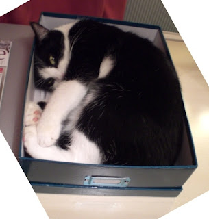
A bit of light relief. Here's Bobby in a bigger box, he outgrew the old one! Does that look more comfortable? I don't think so!
And ... here's Barley
How's a person supposed to get any work done around here?


1 comment:
Oh, looks like it's going to be a luscious green!
Ha ha - love the cat photos! :o)
Post a Comment