Tuesday 20 December 2011

'Tis the season .....


"I wonder why I'm stood standing here when I should be dangling from a tree by now ..?"


"Good Grief, now she's made me pose with some baubles just to show everyone how small I am ~ how humiliating!"


"You've got problems, she makes me sit right at the top of the tree just because I've got a halo and a silly gold-beaded dress.  People keep telling her I don't look like a proper fairy but she drags me out every year and perches me up there.  It's really uncomfortable actually."


"Personally, I think she's flipped ... Christmas does that to humans, it's really sad.  And, of course, she has messed up on a couple of drawings lately ... that wouldn't help either, would it?  Anyway, while she's faffing around with the rest of those gaudy baubles, shall we go down the pub?"


"Yea, good idea, that'll teach her!  Maybe we should wish that person who reads her blog a Merry Christmas before we go."

"What do you mean "that person"?  There might be more than one.  Unlikely, I know, but some people like to read stuff like this."

"Really?? ... hehe, they must be as crazy as she is then!"

Thursday 8 December 2011

Flat tyre in London and ... not sure about the Cyclamen!

As I was saying on Saturday, driving in London is not for the faint-hearted!  Three hapless females from the Home Counties in a little Fiat 500 crawling down the Euston Road and heading for the Foundling Museum in Hunter Street, Bloomsbury.  Karen, my sister, was driving and yes, we had the sat nav on but the woman's dulcet tones were directing us to keep turning right when Karen's instincts were telling her we needed to head left.  We duly obeyed the 'voice of wisdom' (sat nav) until, after circling that area three times and ending up on the same congested road, we decided she was just having a laugh and switched her off!

The air in the car started to turn blue with phrases such as "I don't recognise this &**$%^** ing road at all!" and "why do all these **$%^£** ing tourist buses want to come down this road?!"  But ranting is futile in these situations and we ended up laughing about it.  On the third circular detour Karen pointed towards the left, in a eureka moment, and yelled "that's the road we need over there!"  As I was sitting in the front passenger seat, I turned, smiled and waved sweetly at the driver of the black cab to my left (like he had any choice but to give way!) whilst Karen quickly pulled across two lanes, shot round a corner, 'Italian Job' style, and drove triumphantly into Hunter Street.  This is probably the 'bread and butter' experience of all seasoned London road users, I know ~ you have to be forthright and fearless!  But we are greenhorns from 'out of town', what do we know!

We pulled up outside the Museum and were pleased to find a free parking space there ~ imagine that?  Unfortunately, though, Karen had flattened the front left tyre having clipped the kerb rather sharply.  The air turned blue again for a while after which we decided there was no way we were going to conform to that 'helpless females can't change a tyre' stereotype.  After all, we had a full tyre changing kit in the car boot complete with an idiot's guide.  How difficult could it be? 

It would have been a doddle but for two things.  It transpired that 1) none of us had the physical strength to shift those long bolts on the wheel, even with the wrench provided.  And 2) the triangular mark on the car body, indicating where the jack should be placed, was just not visible to the naked eye.  One of us would have to lie flat on the ground to get closer to where it was supposed to be.  Well, mum wasn't keen ... she's 77 years old and has arthritic knees.  It was down to one of her daughters.  Karen and I looked at each other ... no chance!

Hmmm ... you guessed it!  We had to stoop to calling over an unsuspecting, strapping young man to help us out.  Weren't we grateful when a cheerful chappie, who happened to work at the museum, promptly came across and fitted the new temporary wheel.  Bless him!  He would not take any money for his trouble even though we insisted, but we did explain all to the Museum staff when we finally got inside. 

The return journey on that new tyre was a little hairy ... ever tried driving up the MI, when it's clear, at 50 mph (max allowed on a temporary tyre)?  Other drivers just don't get why you're driving so slowly!  We got home safely though, and Karen sent our knight in shining armour a thank you card and box of Cadbury's Heroes ~ very appropriate!


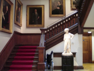
Shame I didn't take pics of our little escapade but here's a photo of mum and Karen standing by a statue of Thomas Coram, founder of the Foundling Museum ~ another hero!


Enough of my ramblings ... what about my art?  I started a drawing of Cyclamen, a crop from some photos I took of these flowers.


9" x 12"  Various coloured pencils on Sennelier La Carte Pastel card.

I wanted to attempt this on 'Leaf Green Dark' Colourfix paper but my supply of that colour has run out so I thought I'd try it on La Carte, a good quality sanded paper.  It's not as rough as Colourfix but I just can't seem to get the results I want on it.  I've stopped and started so many times, trying different colour combinations, different pencils, but this drawing is not flowing well at all.  I don't usually have this problem and I'm not sure what is happening. 

The reference photos I'm using are not great but I usually get around that by being 'creative', using my own instincts.  I have the plant itself in front of me, too, for reference.  These colours are not working well together, to my mind.  Maybe it's because this is a cool colour scheme and I much prefer warmer colours.  I'm not quite at the 'giving in' stage with it yet .....  but almost .....  we'll see.   

Saturday 3 December 2011

Trip to the Foundling Museum, London

I LOVE London.  Every so often my sister, mum and I take a trip down to London, some 30 miles away, to trek around old haunts, especially the City where we used to live many moons ago.  We decided this time to go to the Foundling Museum in Bloomsbury and Karen, my sister, volunteered to drive as we didn't want to spend a small fortune going by train.  Karen is also fearless and pretty familiar with the area ~ you have to be both those things to contemplate driving in London.  Personally, I'd choose to use the tube and buses every time.


The Foundling Museum was built near the site of the old Foundling Hospital, a charity founded by Thomas Coram in 1741 to provide a home for abandoned and/or destitute children.  The Museum is utterly fascinating, tracing the history of the Hospital with paintings, audio recordings and artifacts.  Particularly poignant was the display of small tokens, a lock of hair, a tiny bracelet, a coin, for example, which were left by mothers who had to take their children there, due to their own desperate circumstances.  The tokens could identify the child should the mother become able to return to collect him/her in better times. 

I loved this museum because it combined my interests in both social history and art. The original 18th Century interiors house works of art by some well-known British artists such as William Hogarth (a founding governor of the Hospital), Thomas Gainsborough and Joshua Reynolds. Paintings and sculptures were donated to the Hospital, often by the artists themselves, to support Britain's first home for abandoned children.

"The Pinch of Poverty" by Thomas Benjamin Kennington, 1891.  This particular painting caught my eye as I was going up the grand staircase to the next floor.  It tells a story, rather sad but very 'real' none-the-less ... and is more arresting than commissioned portraits of well-heeled patrons, I think.

 Anyway, we had a great day out despite the mishap that happened when we arrived at the museum.  I'll talk about the flat tyre debacle in the next post.  I'm also starting a new drawing of winter cyclamen from my own photo (wahaaay!).  To be continued .....

Friday 2 December 2011

Pretty Flamingo Finished


Well, I've cut to the chase on this one and finished it.  I got too engrossed to stop and upload the interim stages!  I spent rather longer on the background than I normally do, fussing about with the water.  I took a few liberties with the water which I think is ok ~ not much point in slavishly copying the photo since the camera distorts the colours and tones in the actual scene anyway.  I did try and represent the bird accurately though, those feathers were a challenge. Not sure if I'll be doing another bird for a while ... but it's good practice!
 

Tuesday 29 November 2011

Pretty Flamingo WIP 1


7" x 5" Coloured Pencil on 'Elephant' Colourfix paper

This drawing is based on an original photo by Michael Klinkermallie posted on the Paint My Photo website


N.B.  Sorry folks, I hadn't realised that the photos I've linked to on some of my previous drawings cannot be seen by people who haven't signed up to the Paint My Photo website.  I'd really like viewers to see the photos I'm drawing from so I'll do it like this now!  I'll also revise those previous posts so you can see those photos too.

Back to topic.  Well, I'm still faffing around with still life set-ups so that is on the 'back burner' for now.  So .... hmmm, here is something completely different!  I was struck by the elegance of this bird, the way it's just standing there, and the feathery detail that the photographer managed to capture ... kudos to him.  Apparently, flamingos tend to stand on one leg whilst sleeping ~ hence the pose you see here.  As you can see in my drawing, I've taken out the other bird from the image and, of course, I'll not be drawing the other bird's reflection.  I am also simplifying the water but will be putting in some of those nice ripples around the bird's leg.


I'm using Caran d'Ache Supracolor pencils, with the addition of Greyed Lavender and Pink Rose Prismacolor pencils.  I'm also using a Lyra Rembrandt White pencil on the very lightest bits because it has a very fine, hard and reliable, point ... and because I have no Supracolour Whites left!  I'm not smoothing out any colour, just using a small soft brush carefully and also some Blu Tack judiciously here and there.


This beginning stage is always the slowest and most exacting because to get the initial shapes and tones in correctly is key, I think, to the success of the finished drawing.  Those feathers are a challenge!  I'll finish putting in the background, roughly, and then start refining it all.  

Friday 25 November 2011

Still Life Musings

These past few days I've been pondering on what I'll be drawing next.  If you're a reader of this blog before I had my rather long break, or my 'sabbatical' as I like to call it (sounds better!), you may remember a rather traumatic post about my pc crashing out last year.  I didn't have sufficient data back-up and ultimately lost almost all of my own photo references which were to form the basis of future drawings. 

I'm in the process of re-building my reference bank, taking new photos of all and sundry, but especially playing around with new still-life set ups.  It's been a little frustrating because I'm very pernickety, the lighting has to be 'right', the subject matter has to be 'right', the set up, and so on.  Setting up still-lifes of your own takes a lot of time, skill and imagination if they are to be the basis for successful artwork, I think. 

Many still-life artists, those who work from their own set-ups, will share their painting process on their blogs but not many of them describe how they came to choose their initial set-up, their thought processes about what objects to include and so on.  I think that the setting-up process itself is as important, time-consuming and skillful, as the production of the artwork created from it.  I know there are certain artistic conventions when it comes to colour, composition, positioning of objects which are understood by those 'in the know', trained professionals and the like.  I'd just like to see personal set-up choices being described more often, I think they deserve a mention.

So what prompted me to raise this?  Whilst browsing around art blogs, I came across some still-life artwork which really made me sit up and drool!  Some readers may already be familiar with Abbey Ryan's work, especially in the US, but she's new to me!  She paints directly from life, usually quite small pieces and pretty quickly too.  What I love about her work is its simplicity, bold realism and ..... well everything really! Obviously personal taste comes into this and it's not everybody's cup of tea but, for me, she has a very modern take on what is essentially traditional, classic still-life painting.  Truly beautiful work.  There are videos of Abbey on her site painting 'live' but I'd love to know more about how she sets up her 'objects', decides on composition, lighting and so on.  Aren't I demanding?  And cheeky!  As if the artwork's not enough, hehe.  Maybe I'll ask her.

Here are a couple of kitty pics to keep you going until I endeavour to begin another piece of artwork of my own ...

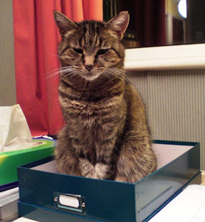
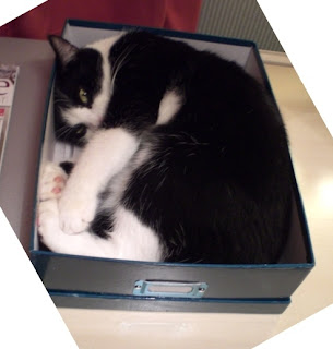
Here's Minnie daring to sit in Bobby's box!  She sat like that staring at me spookily for a good ten minutes.  Very unnerving.  There was no way she was going to fit into that box lying down like Bobby, now was she?


And here she is again, in her favourite place this time ...


Friday 18 November 2011

Forget-me-nots nearly finished


Flippin' heck I've gone all painterly!  Well some would say I've been that way for quite some time ... might as well go the whole hog and start oil painting.  On second thoughts, maybe not, I like pencil points, a clean environment and control over my medium too much!

So here is where I'm at with this.  I continued with the background very loosely with the same pencils as before.  I dithered about how much to define those buds at the bottom.  If they are too well defined they could end up being a bit of a distraction from the main flower focus.  The jury's still out on that.  I've kept the pencils sharp and used them very lightly, just mixing the different hues on the paper.  I keep layering to a minimum and don't like to obliterate the paper ... that would feel like I was working against the paper rather than with it, if you see what I mean.

So yes, it looks more like a painting than a drawing.  I'm quite pleased with it as it is but I'll put it away now for a while then possibly tweak it some more if it needs it.

Tuesday 15 November 2011

Forget-me-nots WIP 2


I've done a fair bit more work on this and it's starting to take shape.  That first WIP scan was a bit too dark.  I must remember to scan and upload in the daylight so that the drawing is accurately represented.  It makes a difference when you compare the screen image to the drawing you see in front of you - duh.  This scan is pretty accurate in all respects.

Not being that familiar with these flowers, I did some research ~ I wanted to check out the shapes and colours for different parts of the flowers from the images available on the net.  I like to represent flowers as correctly as I can and I'm happy now with what I'm doing here.  I also discovered more about these little gems.  The name for them seems to have originated from the old French phrase "ne m'oubliez pas" (don't forget me) and "forget-me-nots" was first used in English for these flowers around 1532.  In Germany the word is "vergissmichnicht" ~ wonderful! Try saying that without your teeth in! (English speakers that is, hehe).  I've been practising saying that word all morning, I love it.  Anyway, in Germany in the old days, it was said that wearers of this flower would not be forgotten by their lovers ... so romantic.  And ... in the USA, the forget-me-not is the State flower of Alaska.  So there you go, it's good to learn something new.

Back to topic then, I've started the background using some of the blues I've used in the flowers plus Dark Green, Emerald Green and Prussian Blue.  I was going to cross-hatch the colours, as I did with the Wild Poppy drawing, but decided to draw rough blocks of colour with muted edges instead.  The important thing here is that the main flowers do not 'fight' with the background for attention.  I could have drawn a simpler muted dark background and let the flowers pop out from that.  However, I want to show these flowers within the context that they usually grow, that is, alongside others the same ... or at least give a hint of that.  As I continue putting in the background, I will see more clearly how to make the central flowers stand forward from that background.  I'm loving the Caran d'Ache and Polychromos pencils on this paper.  To be continued ...
    

Sunday 13 November 2011

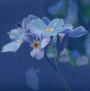
Forget-me-nots WIP 1


8" x 8"  Caran d'Ache and Faber Castell Pencils on Deep Ultra Colourfix paper

Thank you to Ognjen Karabegovic for use of his original photo. 


I started this just yesterday, having cropped and re-orientated the image.  The original photo stands as a piece of art in its own right, I think, but I wanted to focus in on a small cluster of these flowers and see what I could do with it ... couldn't resist!

So, here's my offering at the very start of the drawing.  Yes, it's dark, isn't it?  It will emerge much brighter as I progress, well that's the plan anyway!  I've not used this paper colour before, bit of a gamble, but I think it will serve as a good base for the colours in the image and, of course, it will also provide the drama I like so much.

I'm using the Caran d'Ache Supracolor again, they work so well on this paper and sharpen to a lovely fine point.  The blues are good but they are all quite cool (greenish) so I'm also using some Faber Castell Polychromos warmer blues, notably Ultramarine, Light Ultramarine and Helioblue-Reddish.  I tried out some Prismacolor blues but the first one I used, Powder Blue, promptly broke ... and kept breaking until I blitzed it in the microwave oven for 20 seconds!  Well, you know, I shouldn't have to do this to a pencil to get it to perform, should I?  I don't have this problem with ANY of the other pencil brands I use.  So please, please, Prismacolor makers, before you produce any more fab colours for your range, can you sort out the breakage problem first!  It's no good having a million whizzy colours and high lightfast rankings if the pencils keep breaking!  I know I'm not the only one to have noticed this.

Ok, whinge over.  I'm off to get back to my Forget-me-nots ...  Think I'll have dinner first, I'm hungry!

Added later ... Just discovered that forget-me-nots are a symbol of remembrance.  How fitting then for today is Remembrance Sunday ... Lest We Forget.

Friday 4 November 2011

Little Boy Portrait Finished


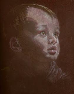
Well he's definitely finished now after much tweaking, mainly on the clothing.  I didn't cover the whole paper down to the bottm, partly because I wanted his face to be the principal focus and partly because ... well, I'm just too lazy!  Trying to get an accurate scan of it, after adjusting for colour and contrast, drove me nuts.  I took it out in the garden to photograph it but that wasn't much better.  I kept seeing greens on the computer image that aren't in the finished drawing.  Eventually I arrived at this image of it.  It's close, but you have to imagine it without those really dark brown shadows to the left and bottom!

This portrait has been a roller coaster ride but I'm glad I saw it through to the end.  Although I am not 'over the moon' about it, it taught me to keep going even through the early ugly stages.  I have a tendency to give up on a drawing when I don't see it looking promising almost immediately.  Of course, some pictures really do turn out cruddy and you wish you hadn't spent so much time on them, but others turn out well and you're glad you did!  I am pleased I stuck with this one because even though there are many bits that could be better, aren't there always!, I feel like I'm moving forwards with my portraits ... and that can't be bad.
      

Tuesday 1 November 2011

Little Boy Portrait WIP 3 Getting there!


Well I think I've gone through 'the burn' on this one (lol) and it's finally starting to work.  Lots of pencil tickling, blending, adjusting, tut-tutting and adjusting again ~ you know how it is!  I couldn't understand why his right eye didn't look right, then I realised it needed an upper lid .. hmm.  I added some Dark Umber (Prismacolor) to the left background and kind of merged that area with his hair on that side.  I see the image here has that scan shadow down the left again, it only shows up like that when I upload it here ~ really annoying.

I'm using the Caran D'Ache Supracolor dry and blending with cotton buds.  Pale browns, Yellow Ochres, Pinks, Apricot, Reddish Orange, Cream and White.  I'm also using FC Polychromos Light and Medium Flesh, Sky Blue, Raw Umber and some Prismas, including Greyed Lavender, Artichoke and Bronze.  The lighter Caran d'Ache colours are much less waxy, as I suspected, and are working well on this paper.

I'm finding this drawing much more exacting to do than previous ones, probably because of the subtle colour changes and details that just have to be 'right' on a portrait.  It can so easily go horribly wrong!  Not much more to do now.  I'll work on his clothing next, especially on that left hand side, but it will be loosely rendered, and then final adjustments ... 
      

Sunday 30 October 2011

Nil Desperandum! The portrait continues ...


Worked a fair bit more on this, as you can see.  I've just had a tip from Pauline Longley about applying mineral spirit to the base colours and then continuing to work on as usual.  Thanks Pauline, I didn't think of that!  I'm not a big fan of solvents to be honest as I'm not too bothered about having a smooth finish, however, it may have been useful here in getting a smooth light base to work from.  Can't do it on this one now because I've done a lot more work on it.

After a lot of brain-racking about the waxy light pencil problem, I thought maybe a different kind of pencil might help so I dug out a neglected tin of Caran D'Ache Supracolor water-soluble pencils.  I figured they are harder and not so waxy as my usual cps.  I have a set of 120 so a good colour range and I'm using them dry.  Bit of a gamble, they could be really scratchy, but they are going down really well on this paper and they sharpen to a lovely fine point!

You won't believe the number of times I've almost ripped this picture up.  I vacillate between thinking "this is utter c**p, why am I wasting my time?" and "oh it's not so bad, I'll keep going and see what happens".  Well I've kept going and I'm in positive mode at the moment.  The main problem I'm having is trying to get smooth transitions between shades of colour ~ so important for drawing skin.  I seemed to manage this ok on my previous portrait (Rachael) but I think this is harder because the paper colour is so dark.  I'm doing a lot of colour testing around the edges of this drawing and using up a lot of cotton buds blending too!  It's all good learning I suppose.  Lots more to do so I'll soldier on, including adjusting his left eye which is too big.

It's anybody's guess whether my next post will be this portrait or a flower image I've got my eye on!

Saturday 29 October 2011

Little Boy Portrait started ...


About 10" x 8" Coloured pencil on Dark Umber Colourfix sanded paper.  Based on a photo by Rosalind Amorin posted on the Paint My Photo site. 


My thanks to Rosalind for allowing me to experiment with her photo!

This is a rather ambitious interpretation of the photo and I'm not sure it will work ~ well, you have to push the boat out sometimes, even if it sinks!  I want his face to be in the spotlight, as it were, with everything else in the shadows.  Well that's the image I have in my head ... whether I can get that down on paper is quite another thing!  I've simplified the image by leaving out his hand and the chair because they were a bit distracting.  This image of the drawing is pretty accurate but the scan shadow on the left is annoying, can't get rid of it.

So far I've drawn the basic features and blocked in some tonal areas.  I'm using a mixture of pencils, mainly FC Polychromos and Prismacolor.  I've used Artichoke and Bronze (Prismas) along with dark browns for the shadowy bits.  There are also strokes of Pale Vermillion, Cinnamon, Greyed Lavender, Clay Rose in there too along with all the different Peaches.

I'm having trouble with the light areas on his face.  To get his face light enough on this dark paper, I've laid down Light Peaches and Creams with the intention of going in over the top with darker hues.  Trouble is, lighter pencil colours tend to be very waxy, especially the Prismas, and so darker hues do not sit well on top.  I'm getting 'blotchy' patches and it's driving me crazy!  Ah well, I'll keep trying different things on it.  I might crack it ...  then again ... I might give it up as a bad job and start a flower instead!  Hey ho.
    

Friday 21 October 2011

Green Bottle WIP 3 Final


Worked on this some 4 hours or so more.  Instead of going at it in one marathon drawing fest, so to speak, I've been dipping in, leaving it and then dipping in again over a couple of days.  That strategy seems to work better for me because I'm seeing it with fresh eyes each time ~ it's amazing how parts of the drawing jump out at me demanding to be tweaked each time I look!

I refined the foreground area a little more and, having completed the bottle itself, decided that the background did not need to go any darker.  I also decided not to saturate the paper with colour, I prefer the 'grainy' look.  This has been a case of 'softly, softly' pencil strokes, a constant process of adjusting colours and values across the whole image until I'm happy with it.  And, guess what?  I'm happy with it!
  

Tuesday 18 October 2011

Green Bottle WIP 2


Some more work done on this, about 5 hours of careful colour choice ... back and forth with pencil marks until I'm happy with the colours.  So far I've used Dark Green, Dark Umber and Mid Terracotta on the background and numerous greens on the bottle itself.  It needs to be nice and dark but I'd rather not use Black because I feel it somehow deadens the picture by 'killing off' the subtlety of the other background colours.  After all, when you really look into dark shadows, they are rarely simply black are they?  The paper colour choice also helps here of course.  I think the drama is coming through nicely, hopefully I won't over do it!

I'm not layering colours on top of each other but using them alongside each other though obviously there is some overlap.  For example, I'm doing the background quickly with a squiggly circular stroke, first one colour then other colours filling in the gaps.  I like to work up the picture all at the same time so will do one bit and then keep revisiting other bits.  For example, I lingered for a while working on the bottle neck ellipse (always difficult!) and then when my eyes started crossing with the intensity of it I moved away and worked on another part.  I'll keep going back to that ellipse with a 'fresh eye' until I think it's about right.

I'll work a little more on the upper, dark areas of the bottle next and also sort out the foreground area which is looking a bit rough.  What I don't want is a drawing that is too polished-looking ... or too 'sketchy' either.  It's all about finding a good balance, I think.
     

Friday 14 October 2011

The Drama of Glass ~ Green Bottle WIP 1


7" x 5" Coloured Pencil on Brown Colourfix Sanded Paper

I started this little effort yesterday, about 5 hours work done on it so far although it doesn't look like it!  I like green bottles, in fact I did a drawing of a different green bottle on the same paper a while back ~ Blog post back in December 2009.  I took loads of photos of the bottle in different lights and with different backdrops.  I wanted 'dark and dramatic' and this is the image I settled on.

I'm using Derwent Coloursofts, but also some of my favourite Prismacolor greens too, namely Yellow Chartreuse, Chartreuse, Marine Green, Dark Green, Limepeel, Jade and Celadon Green.  There is also some Faber Castell Ivory in there too, where would I be without it!  In terms of process, I'm not working in any orderly fashion here, you know light to dark, for example, - in fact there is virtually no method at all in my madness!  I'm darting about doing whatever area happens to take my fancy.  One guideline I'm keeping in mind is that because the bottle itself is being rendered largely in warm colours, the shadows need to be kept 'cool'.  Early days yet and it's looking rough but the trick is not to panic ... it will come good (fingers crossed!).

A bit of light relief.  Here's Bobby in a bigger box, he outgrew the old one!  Does that look more comfortable? I don't think so!

And ... here's Barley


How's a person supposed to get any work done around here?


Wednesday 12 October 2011

Landscape no-no, history and some trivia

I attempted a drawing from a photo I took recently but unfortunately it was utter rubbish so I'm uploading the photo instead!


I wanted to draw this pic because this particular church has special significance for me.  It is the parish church in a lovely little village in Buckinghamshire called Newton Blossomville.  Many ancestors of mine were baptised, married and buried here back in the early 1800s.  I am writing a book about them and want to include some of my own drawings in it.  This image, however, is far better left as a photo!  I don't know why I thought it would make a good drawing.  Ah well, I'll have to have a rethink, maybe take a trip over there again and take some more photos.

Incidentally, Newton Blossomville has some connection with a chap named John Newton who lived in the small town of Olney, about two miles away.  John Newton was a curate in Olney where he wrote the hymn 'Amazing Grace' in the 1770s.  Apparently, he wrote it after he had some kind of spiritual awakening and it was then put to music and became an anthem for Black African slaves, especially in America.  Beautiful, haunting song and written in little old Olney!  It's amazing what you can discover when researching your family history.

Newton Blossomville is such a gorgeous little village and it's like stepping back in time going there.  The only things that tell you you're in the 21st century are the cars on the road ... oh and the tarmac on the roads too!  Here's another pic of it ...


By the way, I did some final tweaks to my Rachael portrait, straightened out her collar bone for example, and I've posted it on the Paint My Photo site (click on 'View Slideshow' to see it properly).  I'm quite pleased with how it turned out (Good Grief did I really just say that?!).

Saturday 1 October 2011

Portrait of Rachael WIP 4


Er, did I say this just needed a few tweaks here and there and it would be finished?  How foolhardy of me!  Once I got back to it again I could see there was so much to do.  I am always afraid of overworking a piece but this really needed more colour, blending and attention to detail.  I've used cotton buds to blend the colours and it has a painterly look now, easier to achieve on this Colourfix sanded paper I think.

I think it really is just about finished now although I really must revisit that chest area.  It looks like I've given the poor girl a broken collar bone ...oh and a nasty looking boil in that area too! (Sorry Rachael!).  All the flaws show up so clearly when the pic is uploaded.  I suppose that's a good thing ... groan.  Will remedy them post haste.


Friday 30 September 2011

Portrait of Rachael WIP 3


Worked some more on this, mainly the hat, neck area and clothing.  This is a picture with lots of light and shade of varying intensity and allows me to practice getting the tones to look convincing.  One thing I've learned is that if I see a particular area that needs to be darker, it's sometimes better to achieve that by leaving it alone and lightening the adjacent areas instead.  For me,it's all about constant adjustments, little by little, always being mindful of the picture as a whole.

Rachael's hat and dress were rendered only with some of the colours I've already used on her skin and the background.  It gives the image a green tinge I think, but I like it.  It's almost finished, just a few minor adjustments to do here and there.


Tuesday 27 September 2011

Portrait of Rachael WIP 2


I've worked on this a little more today and thought I'd better upload it again before I do too much.  As you can see, I've kept pretty faithful to the original photo although I did crop the image to shift Rachael to the right.  I just think it has more impact like that, more interesting than dead centre.

I hope you can see that I've added in some more colours, not just to the background but to her face and neck too.  The photo does show a wide range of colours in her skin but there's a danger of just 'seeing' the browns and reds.   In real life, there are shades of green, blue, purple and yellow in skin too.  Sooo ... I've added in Sky Blue, Caput Mortuum, Caput Mortuum Violet (Polychromos) and Limepeel and Pale Vermillion (Prismacolor) ... so far.  I've left her neck deliberately unblended for now to remind myself, and show you, where I've put some of those colours.

I've used greens, Bistre and Ginger Root (what a fab colour!) on the background but also in her skin too which helps to unify all the elements in the image.  There's a danger, I think, that if you use completely different colours for the background, the portrait itself can look like it's kind of stuck onto the background.  Hope that makes sense.  I'm using cotton buds to blend the colours together and push the pigment into the paper.  I love Colourfix paper, it takes so much punishment!

I'm really enjoying this project.  A way to go yet.    

Monday 26 September 2011

Portrait of Rachael WIP 1

Approx 8" x 10" Coloured Pencil on Colorfix (Soft Umber)
(Ref: Original photo by Li Newton on Paint My Photo)

Here's Li's original photo ...


I know, it's been a while sinced I posted anything.  In fact, it's been a while since I drew anything!  No excuses except I went off on another path researching my family history.  Genealogy is utterly fascinating and can take over your life ... well all your spare time anyway.  But those (dusty) pencils kept calling and I've had a few prods from blogger friends, thank you good people.

I like to draw from my own photos but I haven't taken any lately ~ must get snapping again.  Looking for some inspiration, I came across this striking photo of a young lady from Barbados by Li Newton (Paint my Photo).  I like her 'dead-pan' expression and the beautiful colours in her skin ... good light/dark contrasts too, so I thought I'd give it a go.  A portrait is probably not the thing to tackle when you've just come out of hibernation, artwise, and you've almost forgotten the techniques you learnt and the way colours work on the paper.  Heyho, I never said I was wise or sensible.  I'm learning again ... fast!

I'm using Polychromos pencils, all the browns, reds, pinks and, of course, one of my favourites, ivory.  One or two Prismas are also in there too, Sienna Brown and Dark Umber.  Early days yet with this and I can see loads wrong with it but I'll plod on.  I'll be starting the background next, bit late I know, and it will be kind of cross-hatched and muted.  Oh and the hat too (been putting that off, it looks tricky).  I'd forgotten how calming, almost meditative, drawing is ..... aaah!        

LinkWithin

Related Posts with Thumbnails